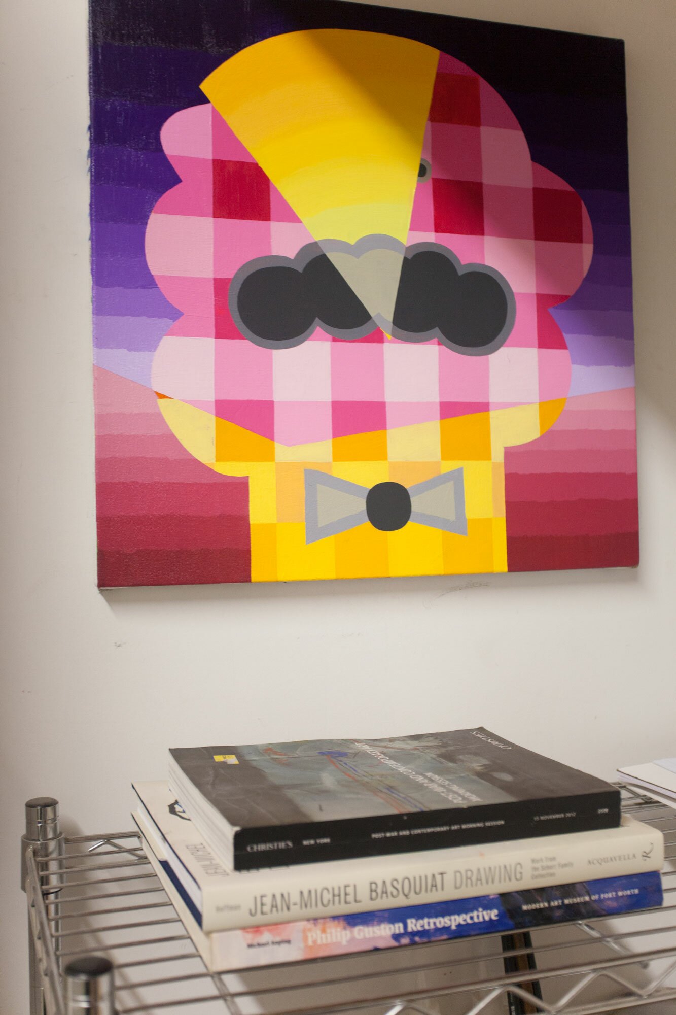
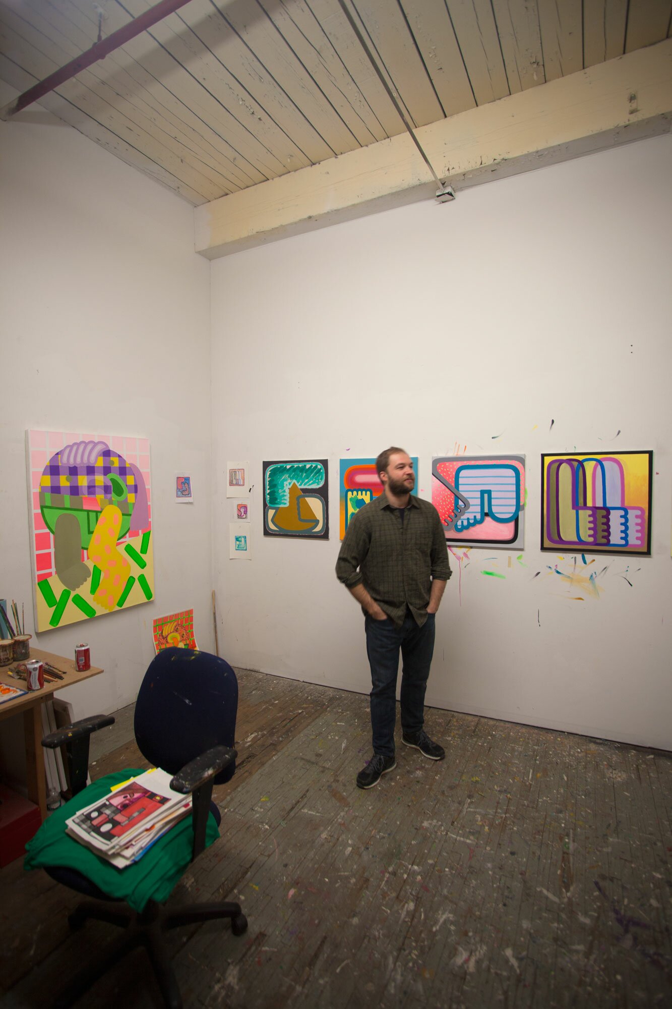
Peter Schenck’s studio is located inside one of the old factory buildings right next to the Gowanus canal. Inside his studio, brightly colored pencil sketches and small pizza box-sized paintings line the walls. We talked about paint handling, the process of building up each of the surfaces, self-deprecating humor and of course, pizza.
Peter is currently preparing for his upcoming solo exhibition in the at the Delaware Center for the Contemporary Arts (DCCA) in Wilmington, DE which will run from April 8th through May 11th.
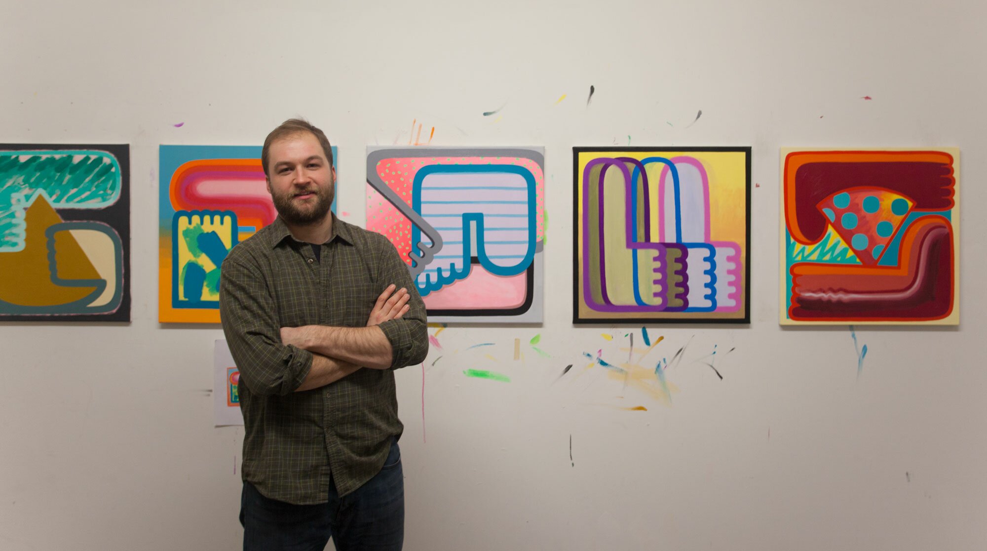
F: Can you talk a bit about your process with your paintings and drawings? How do you start?
P: I usually begin a small drawing (5×5 inches give or take) in crayon and colored pencil. I remember going to a fantastic Roy Lichtenstein retrospective and was blown away with how much of the final imagery of his paintings were all basically thought out in his little sketches, usually no bigger than 6 x 6 inches. When I do begin a drawing, I usually start with looking at older paintings for something that can be pushed further or commented on in a new work. Pizza slices, fingers, toes, arms, and legs have been populating my paintings and drawings for the last year. As a painter, I am constantly aware of my hands, and as an art handler, I’m on my feet most of the time, and I eat more pizza than I should. If I’m away from my studio, I try to make a drawing or two for the day, usually making them in front of my computer while glancing at past images of my work. Then I’ll tack up the more successful drawings in my studio and give them a shot on a 2 x 2 foot canvas, my current size of choice.
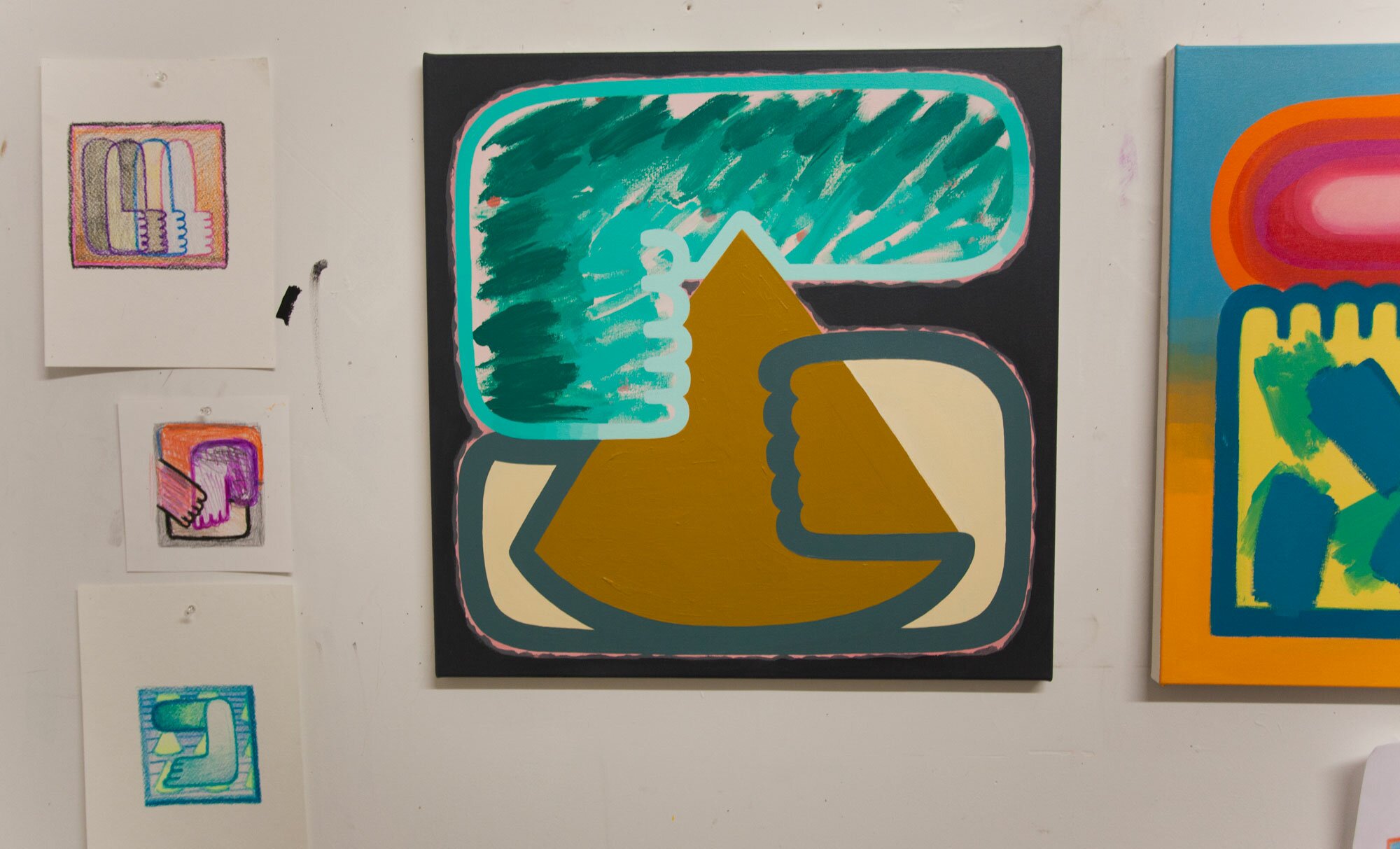
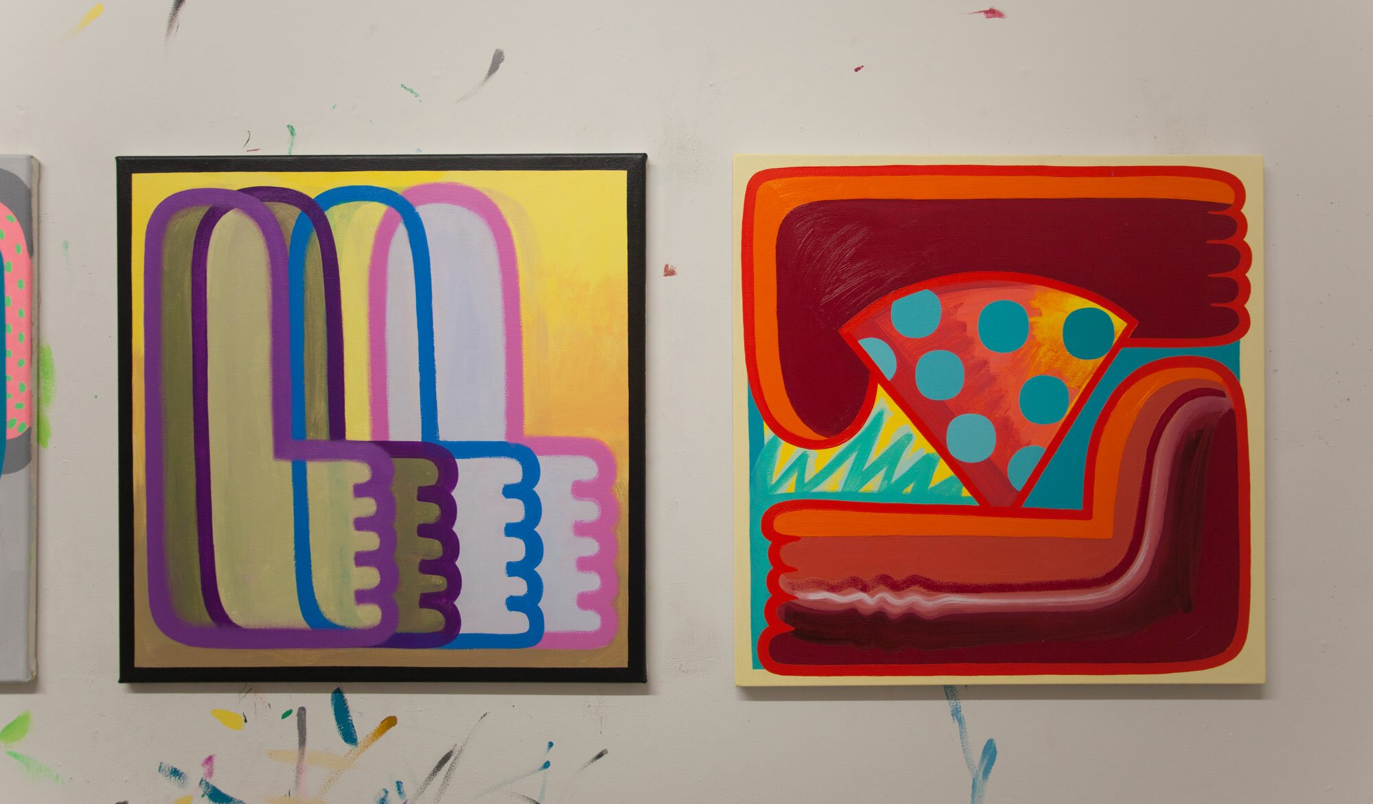
F: Your palette consists of bright unnatural colors giving off an alluring yet toxic vibe. Can you talk a bit about that?
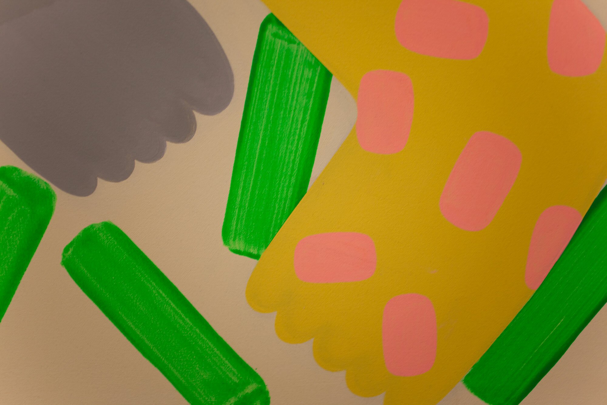
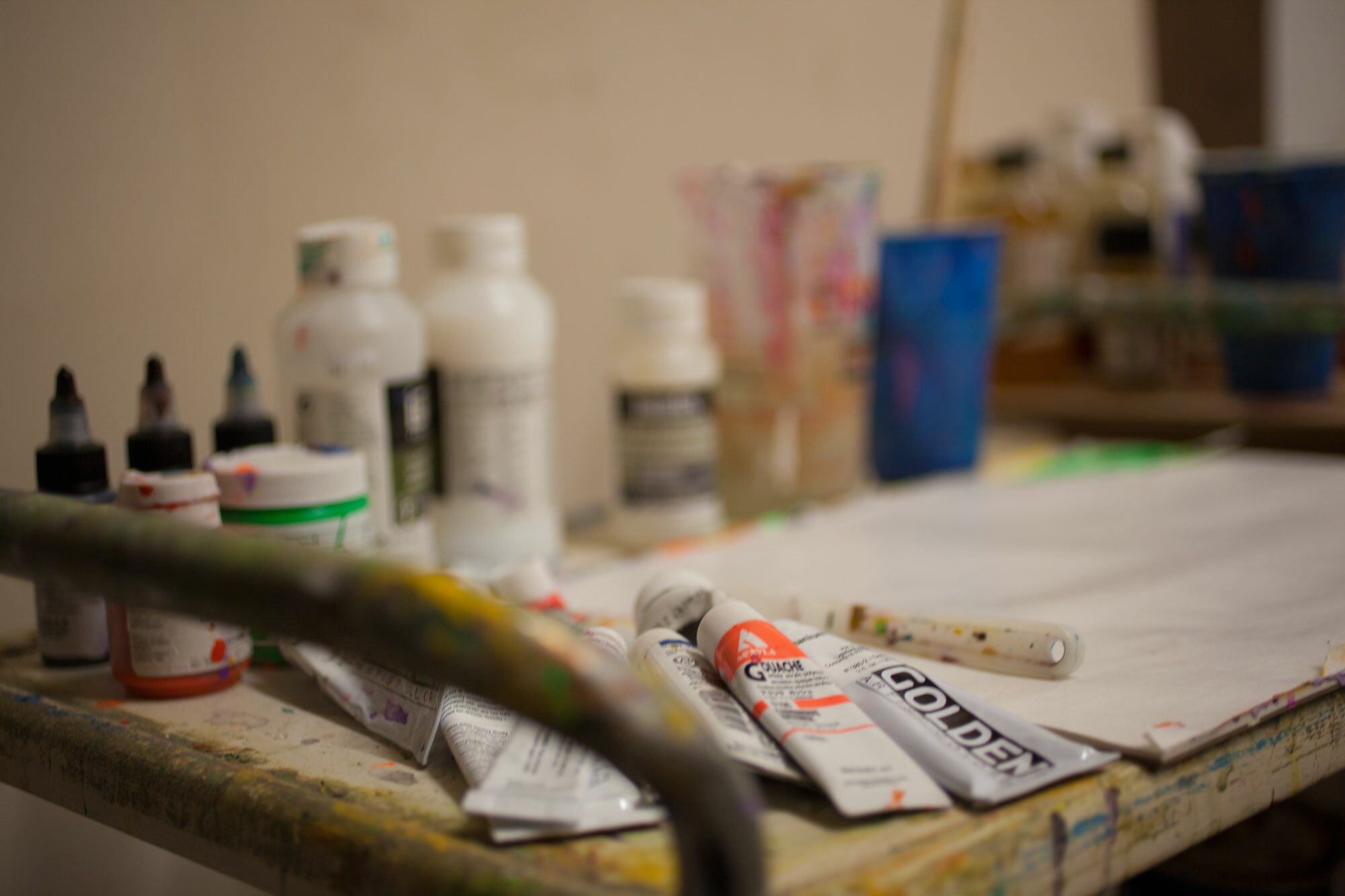
P: Last summer I started using these neon orange, red and green gouaches. I dove right into using them to paint a series of works on paper, entitled “summer dudes” depicting fat, redneck men with pizza slice faces. I wanted to explore the use of garish, synthetic colors in depicting naturally occurring hues of grass, sky and skin. After completing the “summer dudes” series I began thinking more intentionally about the role of these new shades in my work. I began juxtaposing these lurid paints with my previous vocabulary of neutral and primary colors. Frequently I paint one arm or leg in a middle value, while the other is pulsating with an almost off the charts vibrant neon. These discrepancies in color emphasize the fact that the arms or fingers are striving to connect.
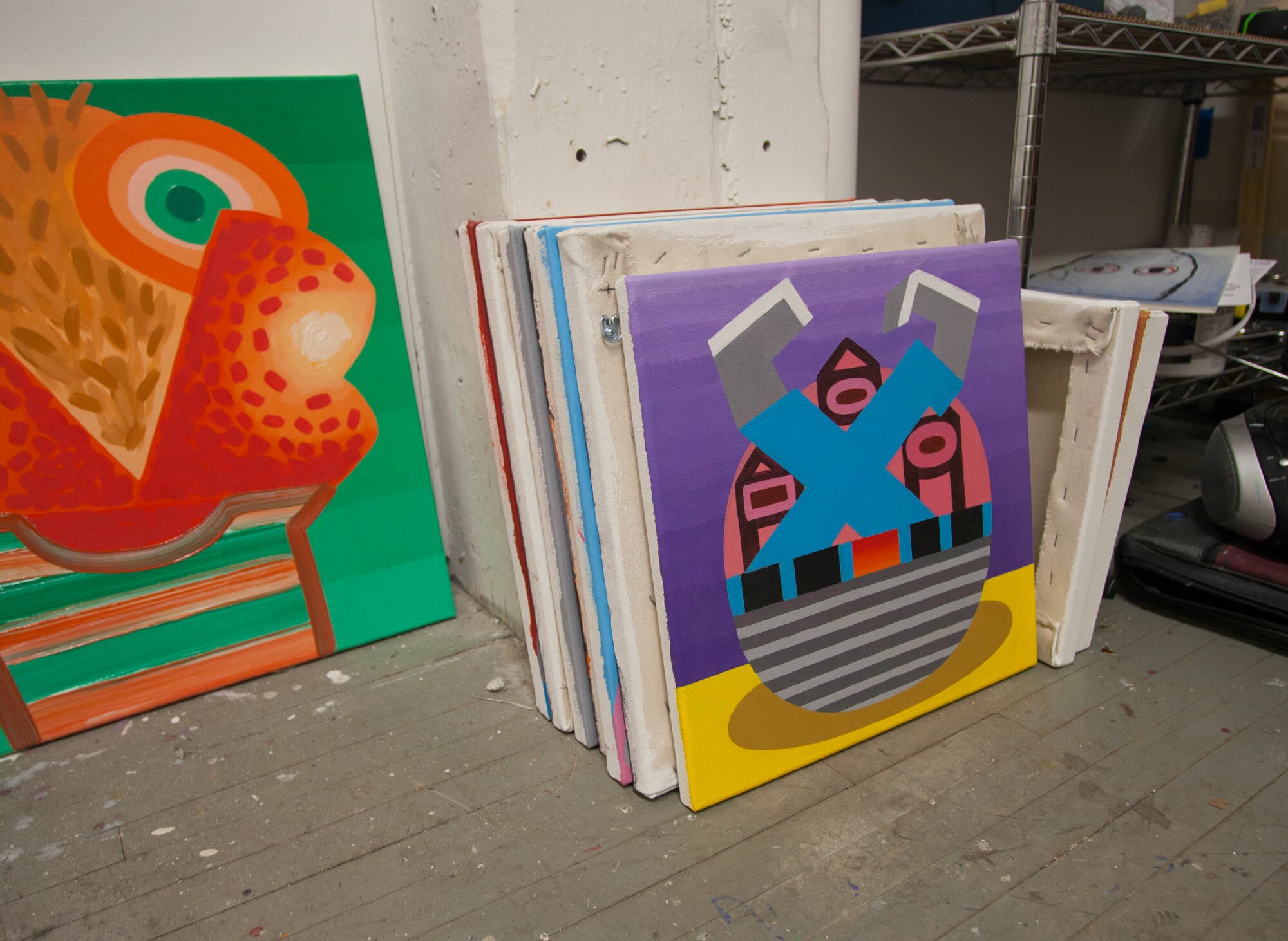
F: You work really thin and build up the paintings into these thicker surfaces. How long do they take to paint?
P: Most of my paintings get blocked in with in a two-week period, and then I will put them aside and revisit them intermittently for three or more months. Much of the time bringing these paintings up to my standard of finish is inactive. They hangout on my studio wall (or floor) with little or no progression. When something clicks while I’m lying on the couch, I make the next move. During this period, I determine what elements are resolved and what needs more attention, fully articulating the role of body parts and background in each painting.
F: How many paintings do you do at one time?
P: Typically, I work on up to ten paintings at a time. In any given week I will focus on three or four paintings to push. I prefer to work on multiple pieces simultaneously since it gives me time to think about the next move while not putting too much pressure on any particular painting.
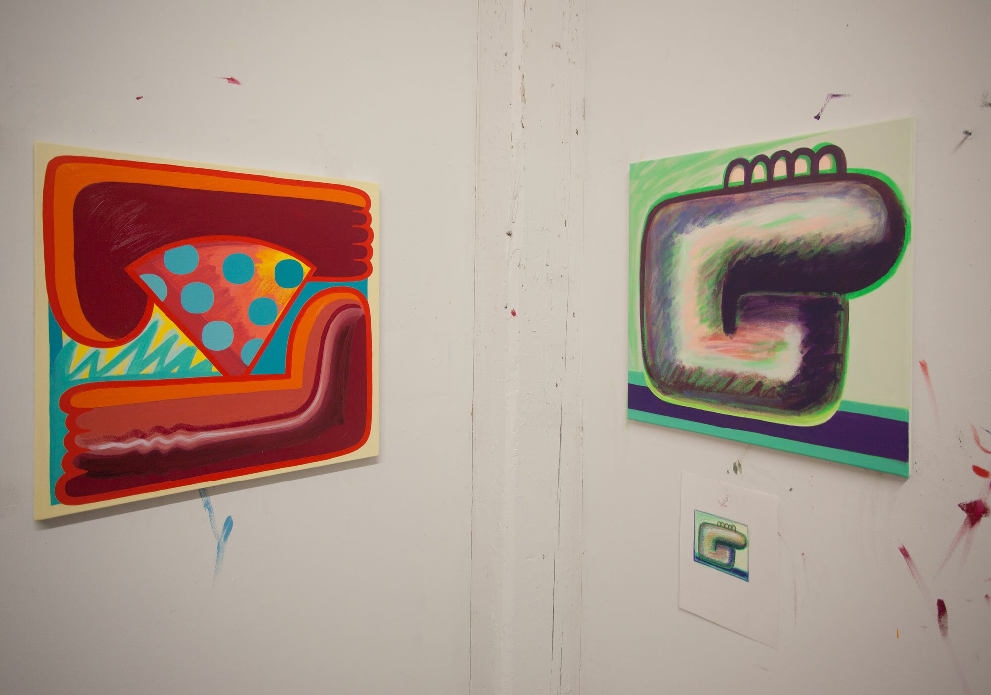
F: Upon close examination I realize that they aren’t taped but rather meticulously painted free hand, allowing for the paint to lip up making this hard edge but juicy quality. Is it important to you to show the paint being paint?
P: Correct, the edges are free hand. In previous works I sometimes taped edges.
I’ve gone back and forth with using tape and what that means to the viewer. I’ve found that my hand does naturally want to tighten up the edges of things, but I’m beginning to slow down that intuitive process if I think a part of the painting can benefit from a brushy or softer edge. That juicy lip quality you mentioned is something I am consciously pursuing in my work. Similarly, Elizabeth Murray’s late work flirted with machinelike execution, while creating a deft comedic lightly-quivering line. This seemingly perfect yet intentionally flawed surface creates a visual reference for an exacting yet personal touch. While in the past, I have relied on a mechanical approach to how I build up my surfaces, I am now interested in creating a dialogue between stark seemingly taped areas and lighter, more fluid textures to show that the paint, is in fact, paint.
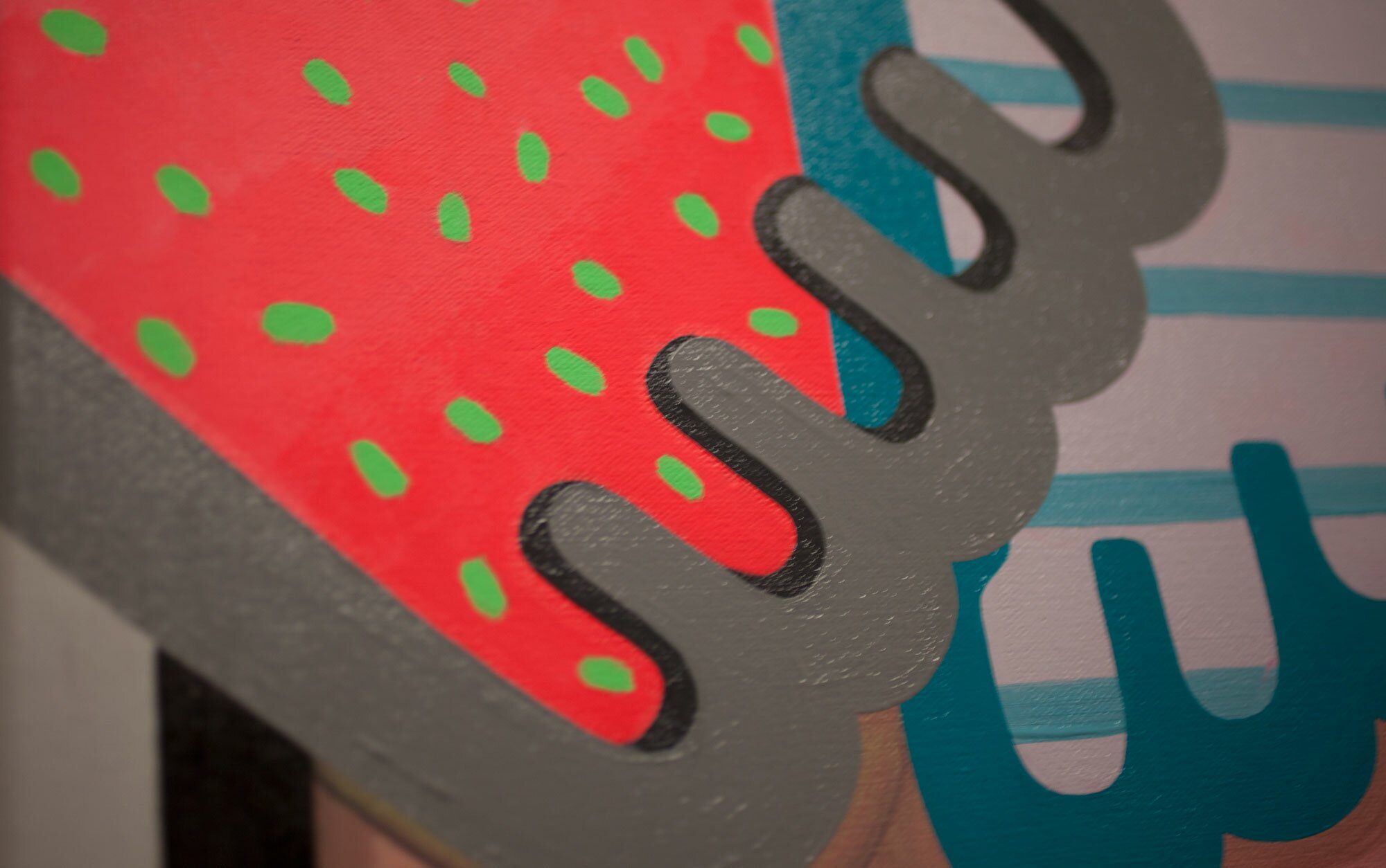
F: Some paintings are done in thin washes and others have really juicy paint. When do you know that the surface works in the painting? Does it depend on the image?
P: It often does depend on the image. Currently, I am enjoying the play of combining thick, juicy oil paint with areas of thin, washy acrylic and gouache. Often, it is the figurative elements in the painting, such as the paw-like hand (a nod to Philip Guston) that are painted with a juicier texture, while the background or a pizza pie wedge is painted with a lean, acrylic gesture. The reason I treat these areas differently is to focus as much attention on the figure as possible.
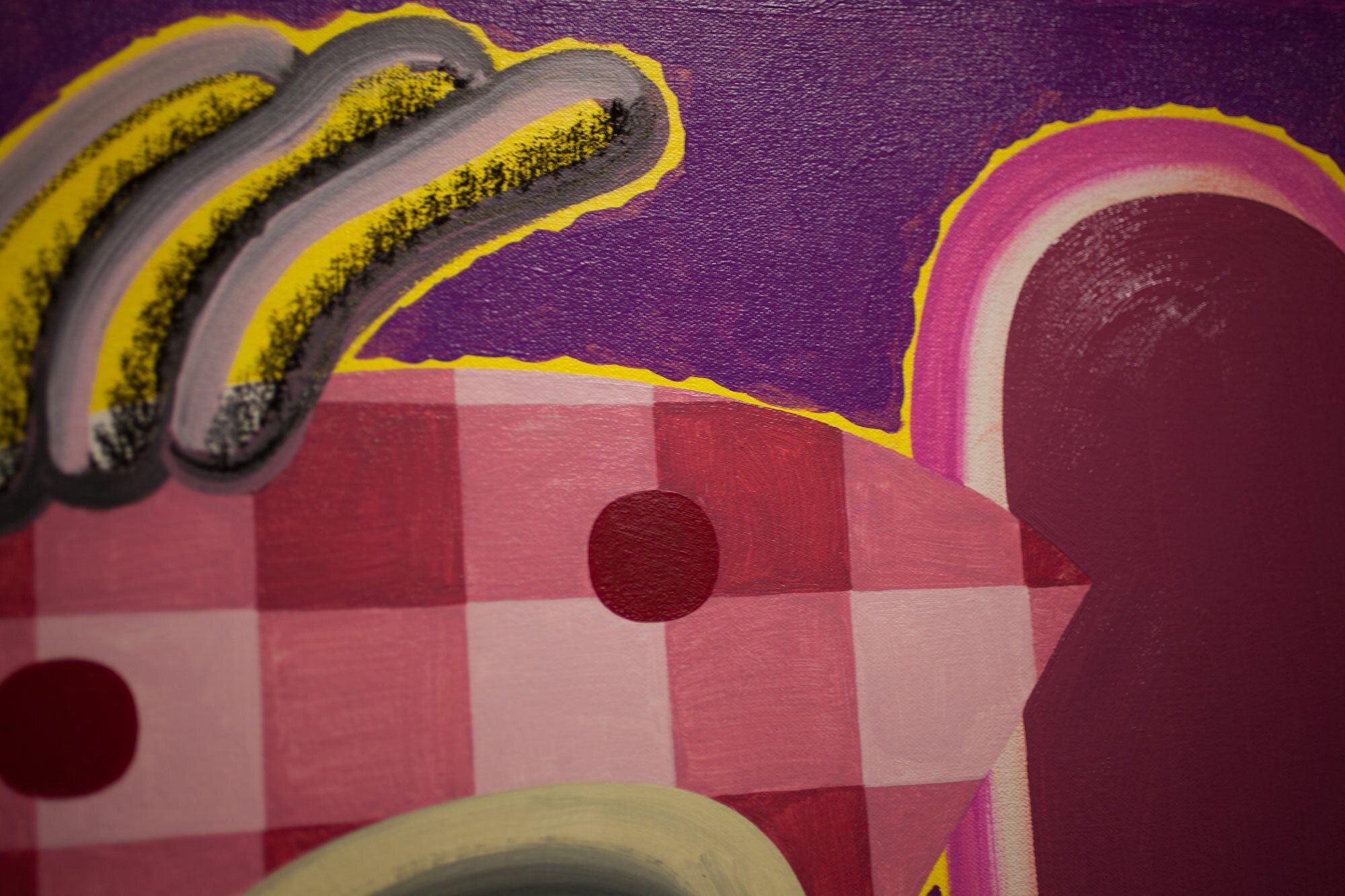
F: Do you use your drawings as a color and composition tool only or are you directly translating the markings into paint?
P: Initially, the drawings were meant as simply a color and composition tool. That was the idea over a year ago when I began painting directly from the drawings. However, right now is a really exciting time for me in the studio because I am making it a point to translate the crayon and pencil marks into the paintings themselves. It is interesting to blow up a pencil or crayon mark that began within a 5×5 inch square onto a 2×2 foot canvas. I recently began a few 4×4 foot canvases, to explore reproducing the markings on a larger scale. For a long time that didn’t occur to me as something that was acceptable for my paintings, but now I’m using crayons and colored pencils, in conjunction with paint to further reference their origins.
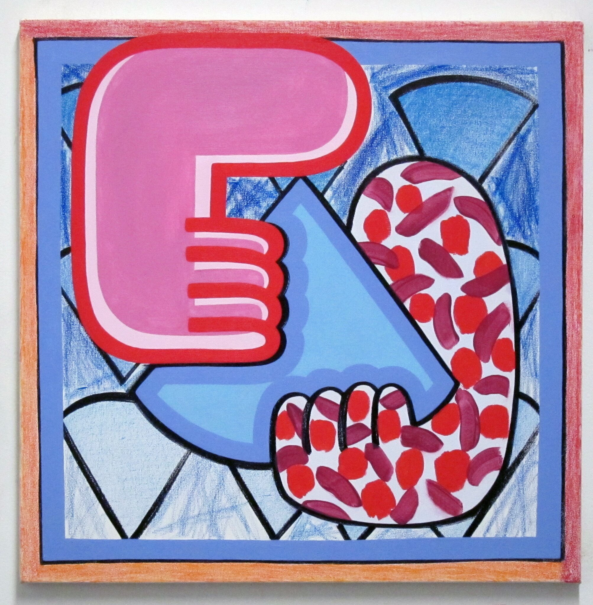
F: The paintings make allusions to phallic objects, hands, feet, arms, legs and greasy late night pizza. There’s a built in narrative, journaling or chronicling certain events or ideas. How does this play a role in the work?
P: Yeah, there are some weird things in these paintings. For the last few years, I’ve been interested in referencing the body without having to paint the whole thing. I mean once you paint something resembling a hand or a foot, there’s the body. Sometimes I like to use a pizza slice as a stand in for a head or a torso, but it’s also clearly just a stupid slice of pizza. It happened by chance that I kept rounding the ends of my “legs and arms” and they then resembled phalluses. I often paint late into the night, and that’s as good a time as any to think about failures and triumphs in love and friendship, these paintings deal with a lot of those experiences. How these hands and feet touch each other, or fail to touch each other, are taken from my own life and helps me process relationships.
F: The square orientation of the canvas is reminiscent of a pizza box or record album. At the same time they relate to a small portrait. Are you consciously making a reference to these other objects with your paintings? What about the square format interests you and what is its relationship to your imagery?
P: I wasn’t initially thinking about the shape and size of a pizza box when deciding on the 2×2 foot canvas, but I think it’s great that it came to mind when you looked at my work. The fact that the canvases could be a reference to a pizza box, which is usually resting horizontally (on a table or my chest), but then mounted vertically on a wall is something weird and funny to think about it. Also, interesting that they remind you of the scale of a small portrait. Whether there is a more blatant reference to a head or not, these images are portraits to me. It’s also a conscious decision that the hands, arms, heads, etc. are close to human scale.
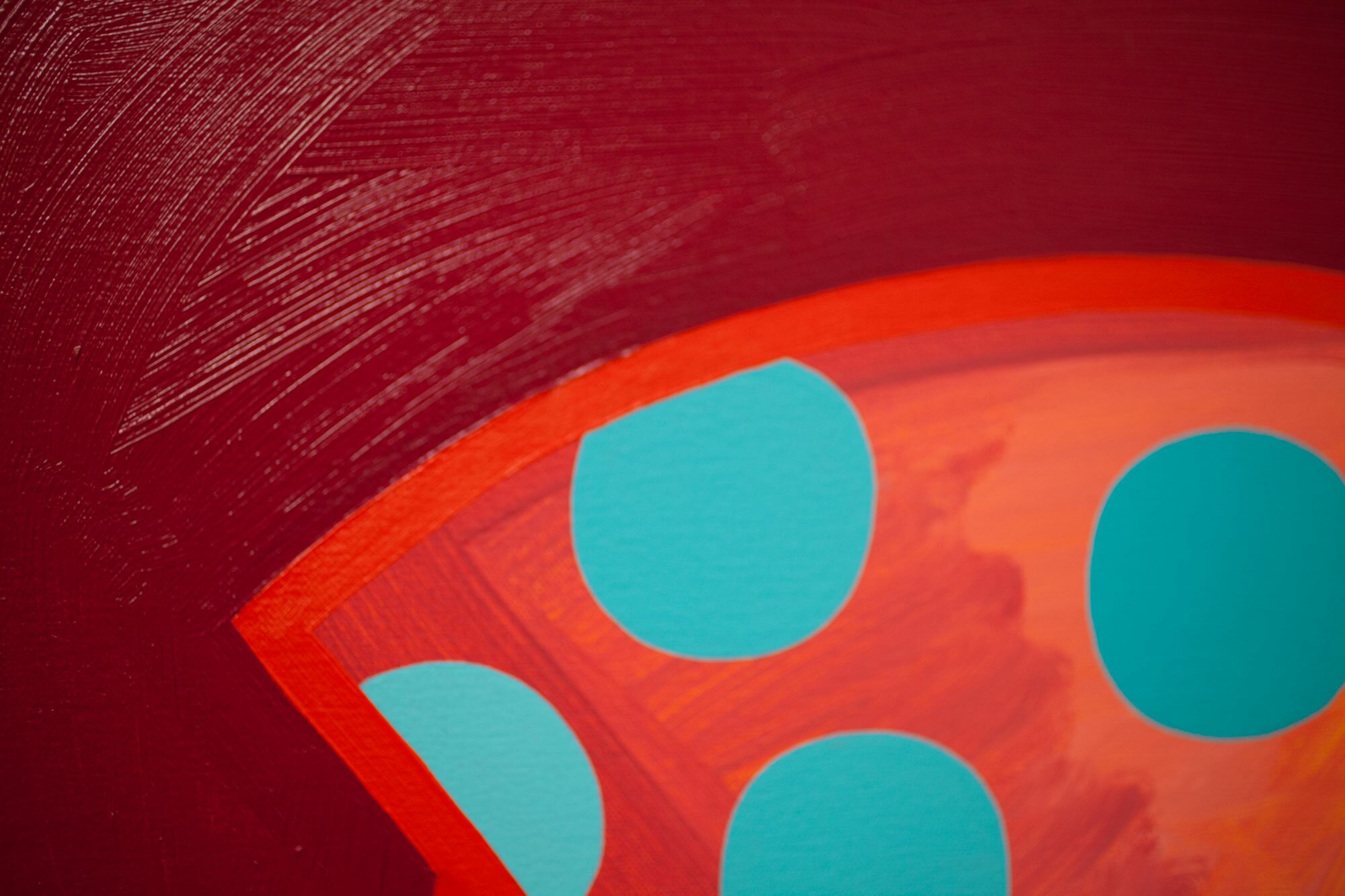
As for the square format, I’ve always just found it to be a very pleasing shape to populate with my imagery, but it became important for my body of work entitled “One More Slice” that I created last spring. In this body of work, I repeatedly placed a large circle in the center of the canvas and then carved it up as I saw fit in order to reference parts of the body, a slice for a head there, a slice or two for a plaid shirt here. I wanted each carved slice, in the center of the picture, to immediately draw the eye to the outer corners. The best way to do that was to use the square, and now I’m too stubborn to change.
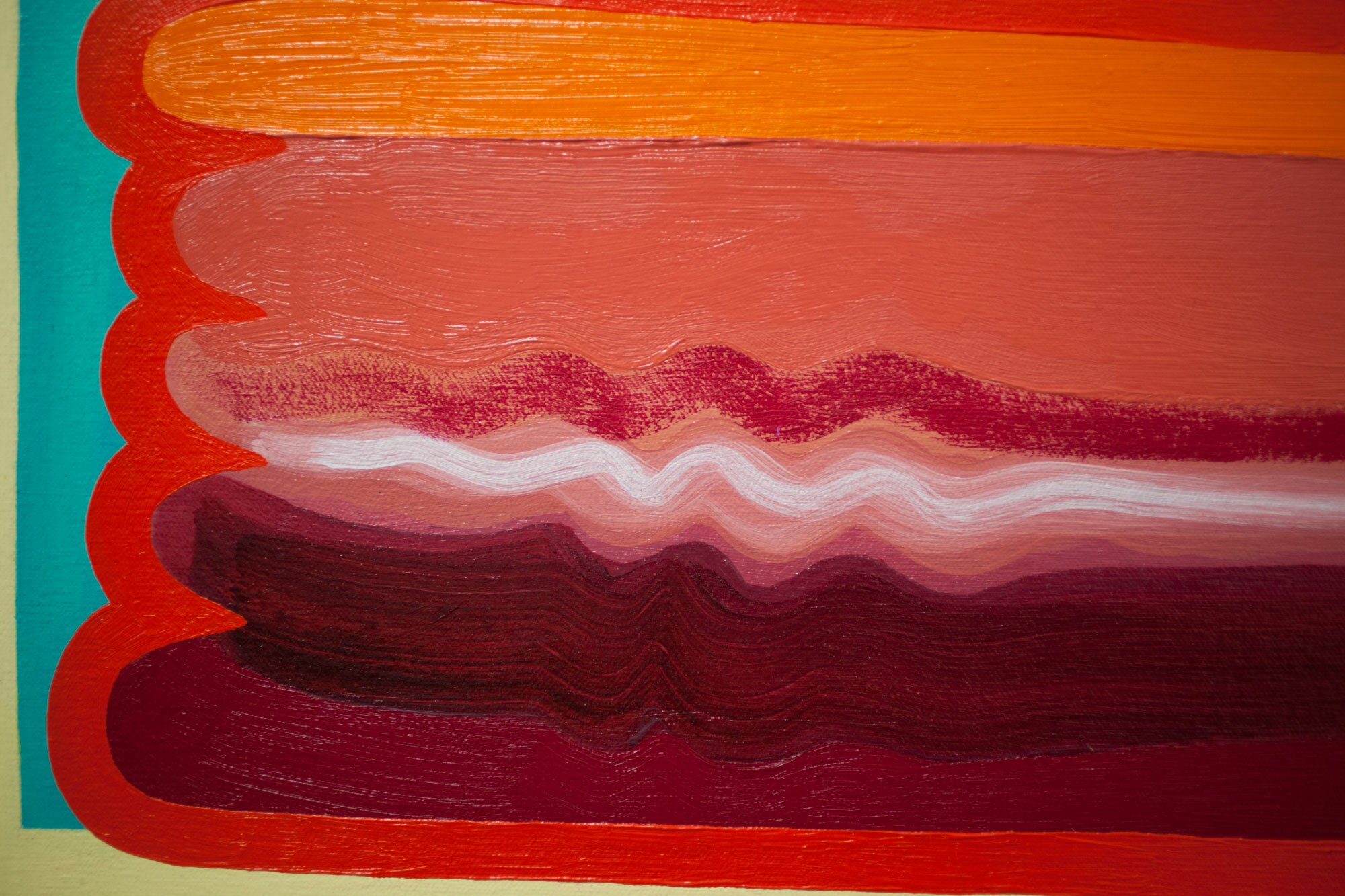
F: There’s a great deal of humor in the way you paint as well what you paint, this kind of signature heavy-handed mark that describes your
“hands” grasping for things. How much does humor and the role of the hand matter in your work?
P: My wheelhouse is a brand of humor in the vein of the tragically sad Charlie Brown. My characters and their hands never quite resolve their desires or know how to express themselves fully, but they still want the chance to succeed! These grabby hands are happy to take center stage, but then find it difficult to simply clasp the other just three inches way. When one paw does actually manage to locate and press its nuclear glowing skin onto its more subdued counterpart, there isn’t any clear evidence of reciprocation, only acquiescence. The tenderness and vulnerability coming from one claw to the other is coldly shut down or at best, acknowledged with only apathy. Humor matters a lot in my work, it’s what makes the complicated life experiences palatable enough for me to depict on my canvases.
Peter is currently preparing for his upcoming solo exhibition in the Art Lounge Project Space at the Delaware Center for the Contemporary Arts (DCCA) in Wilmington, DE which will run form April 8th through May 9th. You can check out more of his work on his website at


