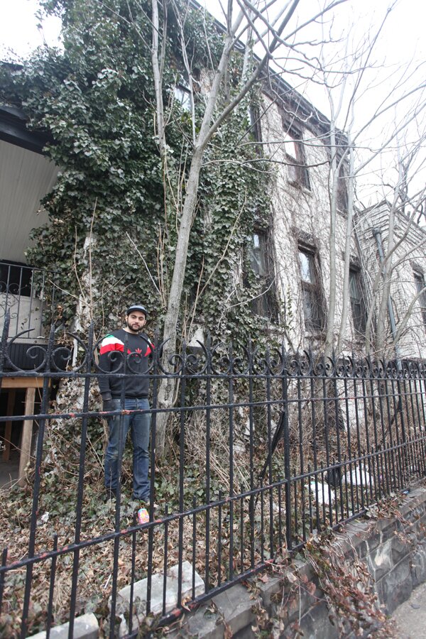
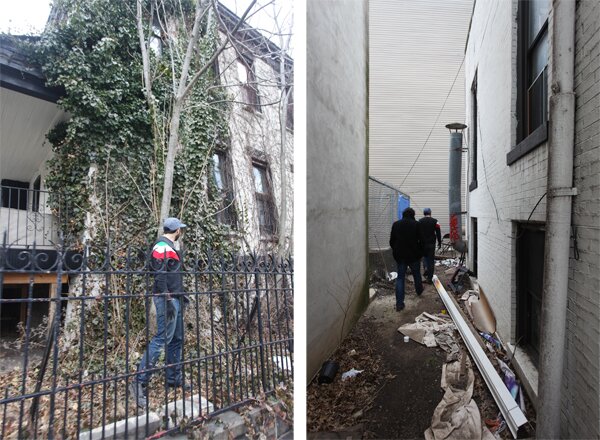
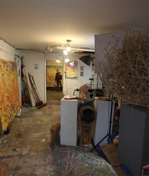
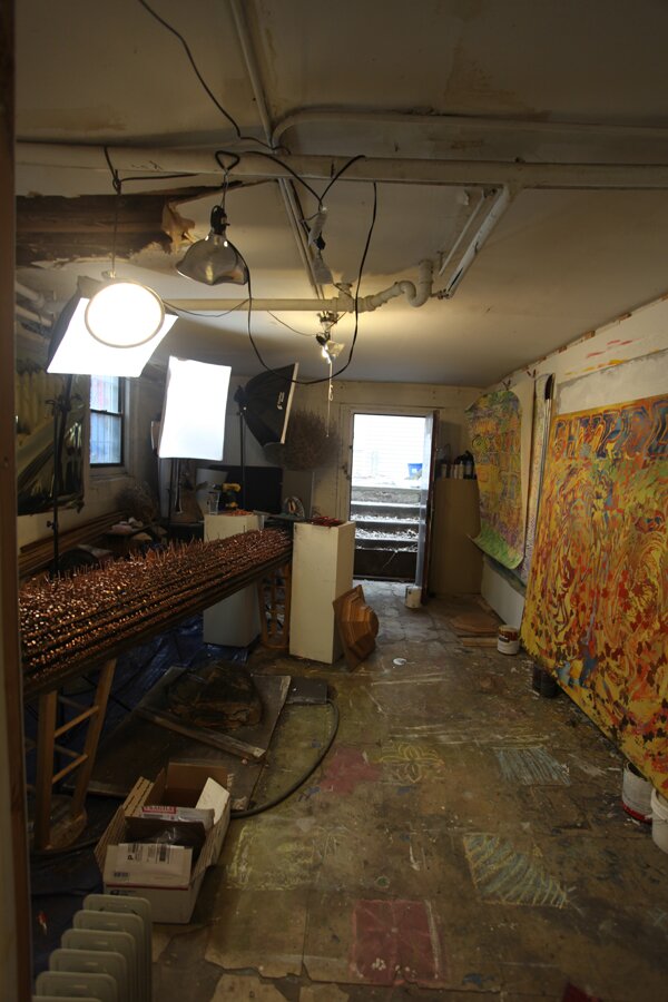
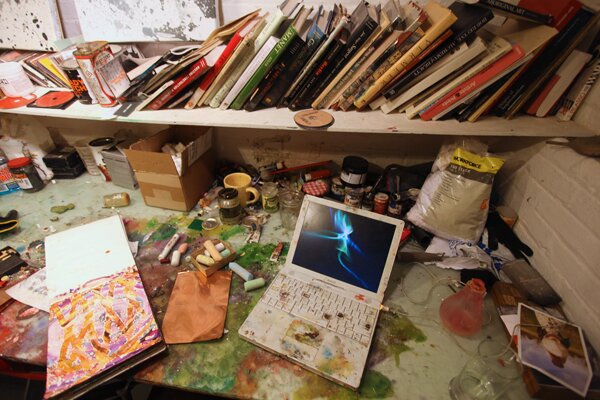
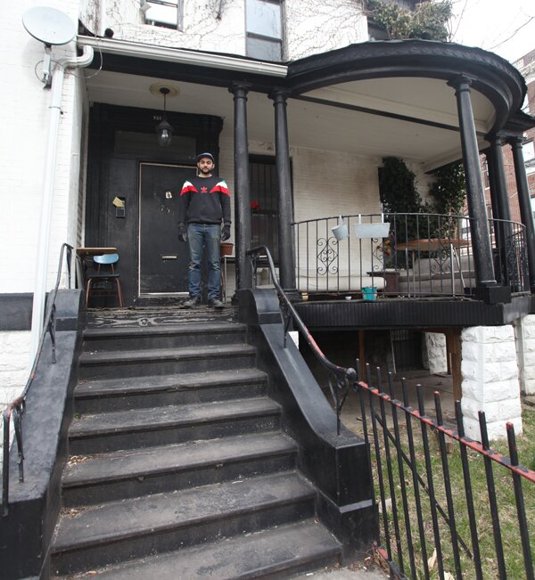
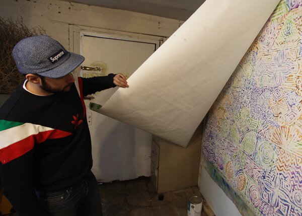
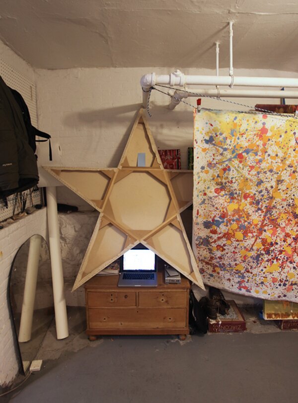
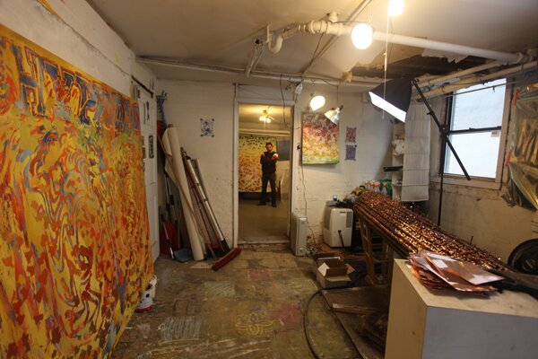
, is an artist who splits his time between studios in New York and LA. Overwrought with ivy, the facade of Ben’s Bushwick studio building is reminiscent of a decrepant New England Mansion . Perhaps it was a nod to his Massachusetts upbringing or maybe it was just the right space for the right price. His basement studio spanned two large rooms: One room for painting and one for more experimental projects. We walked into his space where Ben was getting ready for his upcoming show ‘Rejectance’ at the .
BWN: When I moved in, these pipes would leak such disgusting things, and there was rubble and concrete everywhere, piles of past tenants belongings. This other room was similarly insane, it would flood really crazy whenever it rained, but I fixed it so it doesn’t flood anymore. It was not an ideal place to have a studio, so the space was overlooked, but I worked hard on it and now…it’s not glamorous but I am pretty attached to it.
F: No, it’s awesome and it’s great that you have two separate rooms where you can have different projects going on.
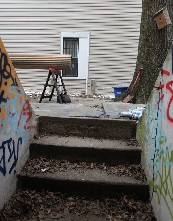
BWN: Yeah, this is the “clean room” where I finish work and this is the “shit room” – where I get down and dirty on larger, grosser projects. I really only paint outside in the backyard now, even during the cold winter months. I picked that up in Los Angeles. I got used to the sun, and not being around the fumes as much.
F: I remember you moved back to LA. Are you originally from there?
BWN: No, I’m originally from Cambridge, Massachusetts. Then I moved down to Providence for school and then out to LA after going on a long roadtrip journey. I got a job in LA and started working there building sets for commercials. I’ve been back and forth between the two cities for 4 years now, spending about half the time there.
F: How does that work out? Do you have a separate body of work?
BWN: Yeah it’s kind of manic because the work I make there is really different from here. All my oil paints are there so I really only make oil paintings there while I work with more mixed media here. So there are these two bodies of work that are building and they have something to do with each other but they’re quite different. I try to put constraints on the work, where I couldn’t possibly make the same work even if i wanted to. Like in LA, I use the trimmings from cannibus plants that my friends grow to make paintings. Here I use Ivy pulled off the side of the house. Both processes involve using native foliage, and I think it would be a lot harder and perhaps more illegal to find cannibus leaves in NY
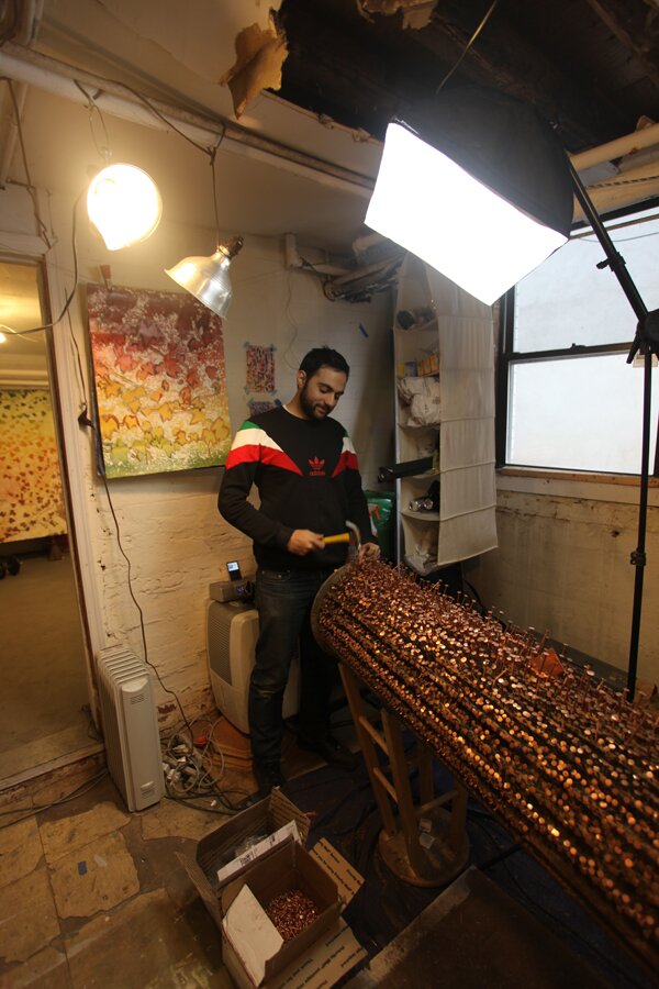
BWN: Recently, I’ve been working on these columns, pillar pieces.
F: Were they found objects?
BWN: I got them in Providence at my friend Garrett’s house, where a bunch of my friends were sort of squatting. Tristan and I found these pillars as we were cleaning out the back carriage house from the 1800′s, before it was to be demolished. They had clearly been in there for decades, I knew I had to use them for a piece. So in the middle of the night I drove down to Providence and we put them in the back of this SUV super heist style. My windshield wipers weren’t working and they were just sticking out of the trunk. I was driving 90 the whole way to NY and it started pouring rain and every time the lights from the oncoming traffic would flash, my whole windshield would light up and I couldn’t see a thing. They were shaking like crazy in the back but I finally got them here at 6 am and have had them here ever since.
I’m going to have a show soon at Ashley Zangle and Talon Gustafson’s gallery space, the . It’s a small space for big ideas, so I’m going to put these huge pillars in there.
F: Will they even stand up?
BWN: No, they will be angled in the space. I have been stripping this one down like crazy and taking all the paint off, I’m pretty sure it’s lead paint. I have two ideas for it. This one either is going to be completely stripped and given its virginity back. After sanding it down, i can tell you the wood is really nice, and it’s pretty rare to have a wood pillar like this, but the other idea is to paint a gradient of faux marble on it, which is something I’ve been wanting to do for a while.
F: Kind of changing the materials in a way?
BWN: But kind of doing it in a 2D digital manipulation meets 3D objects way.
F: Yeah, you’re having to deal with all these grooves.
BWN: And I just think that gradients are something that have always existed in nature but are something that are very much… They have emerged in a more prevalent way with the proliferation of computer programs like Photoshop.
F: They’re the easiest way of showing depth without doing much.
BWN: Yeah that too, so that might happen but I am leaning towards a virgin pillar, because of the contrast to the other, which I’m like fucking up really bad.
F: It reminds me of African voodoo dolls.
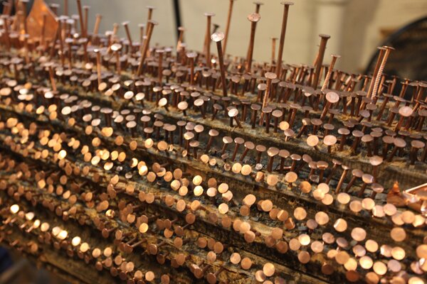
BWN: Exactly! I’ve been really into these African power figures and I’ve always wanted to deal with that. These pillars already had this kind of supernatural energy just because of where I found them, their history, and this Providence, Benefit street hauntedness. I wanted to combine that with this primitive African nail covered, violent, figure treatment. I used the copper nails which I think of as being very New England. This is also just real labor.
F: Like the number of hours or the energy to drive all these nails in?
BWN: Yeah, when I see good art, it usually has either taken someone 5 years to make, or its so damn clever that it took five seconds to make and it doesn’t even matter at all. Unfortunately, most of my ideas seem to end up being the five year kind. So this is that, labor.
F: I like how there seems to be more attention in certain areas. It almost reminds me of when you’re first learning how to draw a face and shade really well and you focus only on one eye. I saw one of the paintings on your site. Is it mostly spray paint and enamel?
BWN: Yeah, there’s a bunch of pretty complicated processes going on but It’s mostly sprayed, enamel and some acrylic.
F: Do you just mask it off with a resist or something?
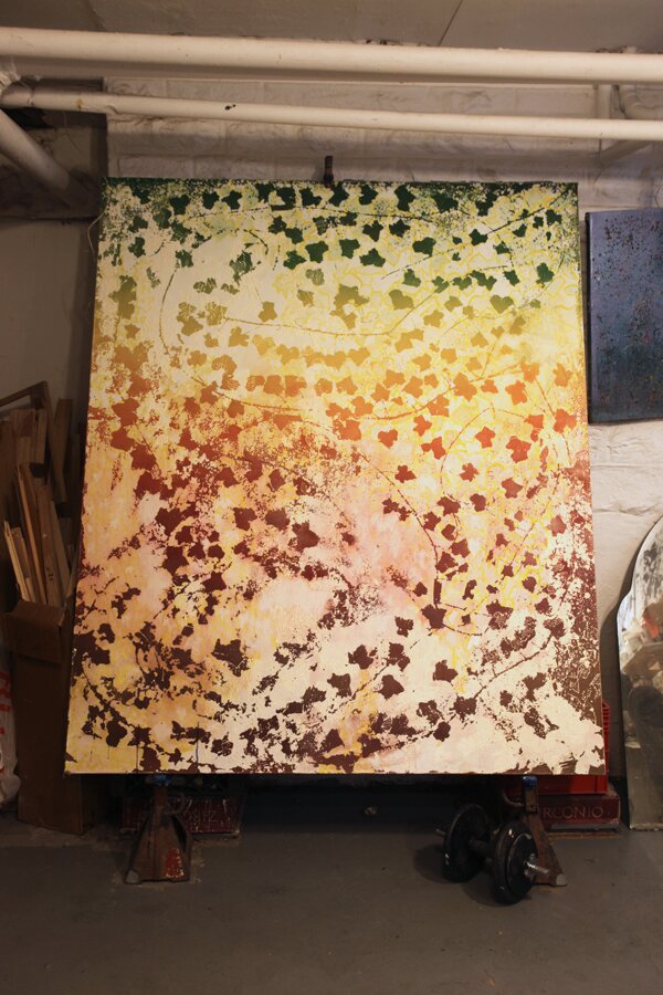
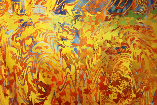
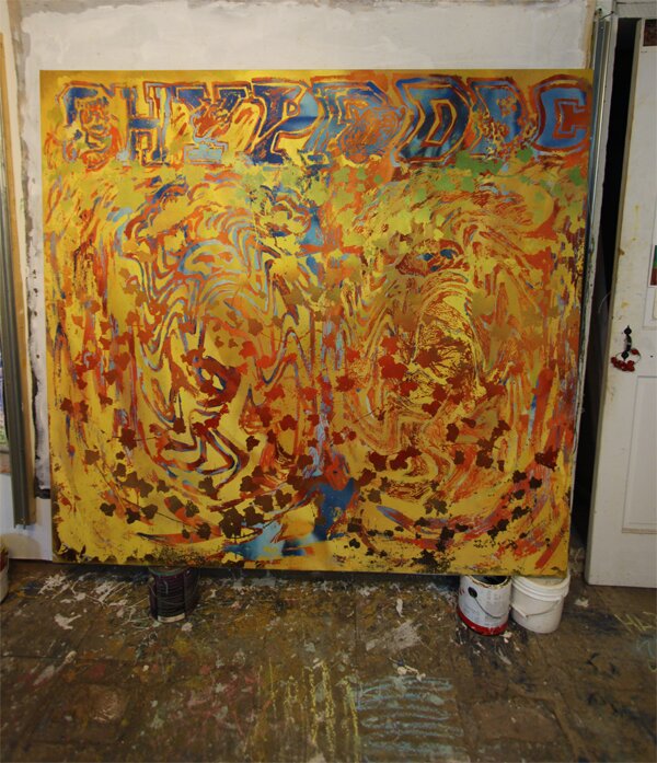
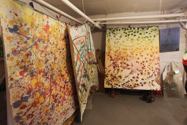
BWN: I use the ivy itself from the house to make the paintings, so I cut the ivy off of the house and I lay it on top of unstreched canvas. I flatten it out with heavy books, and use it like a line drawing. Then I mask out everything that isn’t the ivy and paint the whole painting a color or gradient. There’s this one gradient that I have been working with in my paintings which I refer to as the ‘Autumn Life to Death Gradient’. The cycle that you see in the fall where ivy and all the foliage starts off green on the top and then goes through yellow, to orange, to red, to dark red, and then to brown (dead) as the season changes. I’ve been making ivy paintings since I started working in this house, and painting seasonal change for as long as I can remember. When I moved to New York for the first time, I was struck by the lack of nature and how oppressive the architecture and all the advertising was, for me it’s really all about the people, and work here. I was looking, kind of desperately seeking, to find nature within New York. So I started to become really attracted to ivy as a place to escape and just started staring into the ivy on buildings. It symbolized this moment where nature was alive, taking back architecture and a relationship between a vine or this weed almost that becomes architecture and a picture plane. The ivy is slowly but surely pulling a part the buildings, It’s very beautiful, It’s a beautiful process.
F: It even speaks to being in the ‘Shit room’ and having to take it back.
BWN: Everyone has to fight for space here. The more I started using it, the more meanings it started to reveal to me. As it kind of always happens when you think about one thing for a long time. So now its taken on a new set of meanings… it’s always been a foliage that’s socially loaded to me but now I am focusing more on its associations: with prestige, the ivy league and academia in general.
F: Is that where this image and the seals of the schools start coming into the painting?
BWN: Yeah, there are these ivy league seals that have been digitally manipulated and with different processes, brought into analog painting language. This one has the school letters for Cornell, Harvard, Yale, UPenn, Princeton, Dartmouth, Brown, Columbia at the top, and then two brown seals inversed from each other and then distorted.
F: The whole thing is kind of this pushing back too. The image starts to fall into the canvas further with the materiality of it.
BWN: The spacial quality of it? Yeah, there’s some sort of – the blue feels like a different painting or much further space.
F: You know when you have a really badly compressed jpeg and then isolate it with the magic wand tool, make it fuzzy and then you accidentally press delete, there’s extra little patches of compressed pixels around. These paintings seem like they were created in photoshop but done physically.
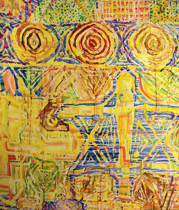
BWN: That is what I’m really trying to do. That weird thing that happens, is what I’m trying to go for. In each one of these paintings, I’m mimicking the way I use a photoshop tool. In photoshop, the alpha layer is the space within the dotted line of the selected image. I’ve been working with that idea where the alpha layer or the dotted line, can be a third image that you see simultaneously in this dadaist way, where you’re confronted with three images at the same time and you have to think about them all at once. In this area, there’s the green form and the yellow and orange circles that are contained within this triangular pattern, so there’s 3 things within one of these things but it’s all on the first layer so the ground shines through.
F: So you get these weird effects where it’s very separated because it’s like 5 colors here and 5 colors here and they’ll never match.
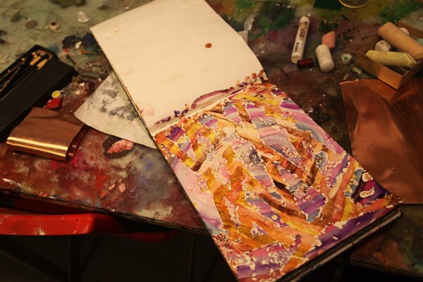
BWN: They’ll never match up. I started exploring watercolor because It was this medium that I was given as a child, mostly because it was really easy to clean up for my parents, but really, it’s probably one of the hardest mediums to use and the definitely the worst one to give to kids. Its all about patience, control, and about how the paper shines through, the transparency of it. I wanted to take back watercolor from my childhood frustration with it and make these works that were all about the transparency and my patience, while always maintaining the first layer of ground within the transparency.
F: Also, the idea that there is that translucence and looking at a back lit screen all day somehow comes into your work.
BWN: Exactly, a sort of informational luminoscity. When you photograph them, they go back to that back-lit quality where there’s this weird light shining through again.
F: Do the alphas go back into the large paintings somehow?
B: It is all based on the idea of taking digital tools and using their new logic to deal with painting history. I think there are these huge shifts in technology that have happened where painting is forced to react in fear of becoming irrelevant or people thinking it’s going to be irrelevant. For example, when photography was invented and everyone thought painting was done for. There’s no more need for realism. Then abstract art becomes the most prevalent thing. I think there’s a shift like that happening where we have a digital culture of image manipulation and creation that we can access with such ease on our computers. Soon or even now, we will be able to 3D print textures that are very similar to the textures and 3 dimensionality of painting but I don’t this is a problem, i think its awesome, I am very committed to updating painting.
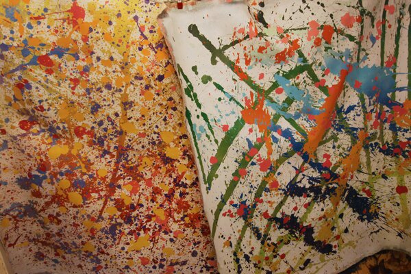
In this other series of paintings, I’ve always been very interested or I’ve always found fascinating, this one linear art history thats so sloppily taught in schools centered around a series of dominate macho-male painters and how they overthrew one another to be the king of art. For example, there’s Jackson Pollock, who is someone that I think weirdly a lot of young artists are thinking about again, who quote end quote “overthrew” European art with his action paintings and maybe the help of the CIA. Everyone was psyched ‘ohhhh, Jackson Pollock,’ he’s this great American hero stumbling around drunk and yet channels these moments of pure kantian genius, splashing the paint all over the place, and thats IT! He’s trademarked spatter paintings. Well, I basically downloaded some of his paintings and then upgraded them with one simple variable, running gradients through each splatter, and that becomes this kind of critique of the action painting. These paintings are actually extraordinarily tedious to make. They still look like ab-ex action paintings or splatter paintings but they’re very meticulously masked out. There’s this gradient that runs throughout each mark and each grand action is thus subverted, so it’s not about any particular moment, it’s really about meticulous process, labor, and ombre. They’re kind of simple one-linears in a way but the more I do them, the more I want them to function both as a successful action painting and successful critique of action painting.
F: It seems like you’re following with them but at the same time talking about them.
BWN: Maybe I should make really big ones, I guess that’s obviously where this train leads. I need to make one that is better than a Pollock using the same kind of language.
You can see more of Ben Wolf Noam’s work at www.yesnoam.com.



you have a really “arty” basement. I like the big yellow painting – looks very vibrant and warm with the yellow colors. have fun with your artwork and keep up your nice blog.