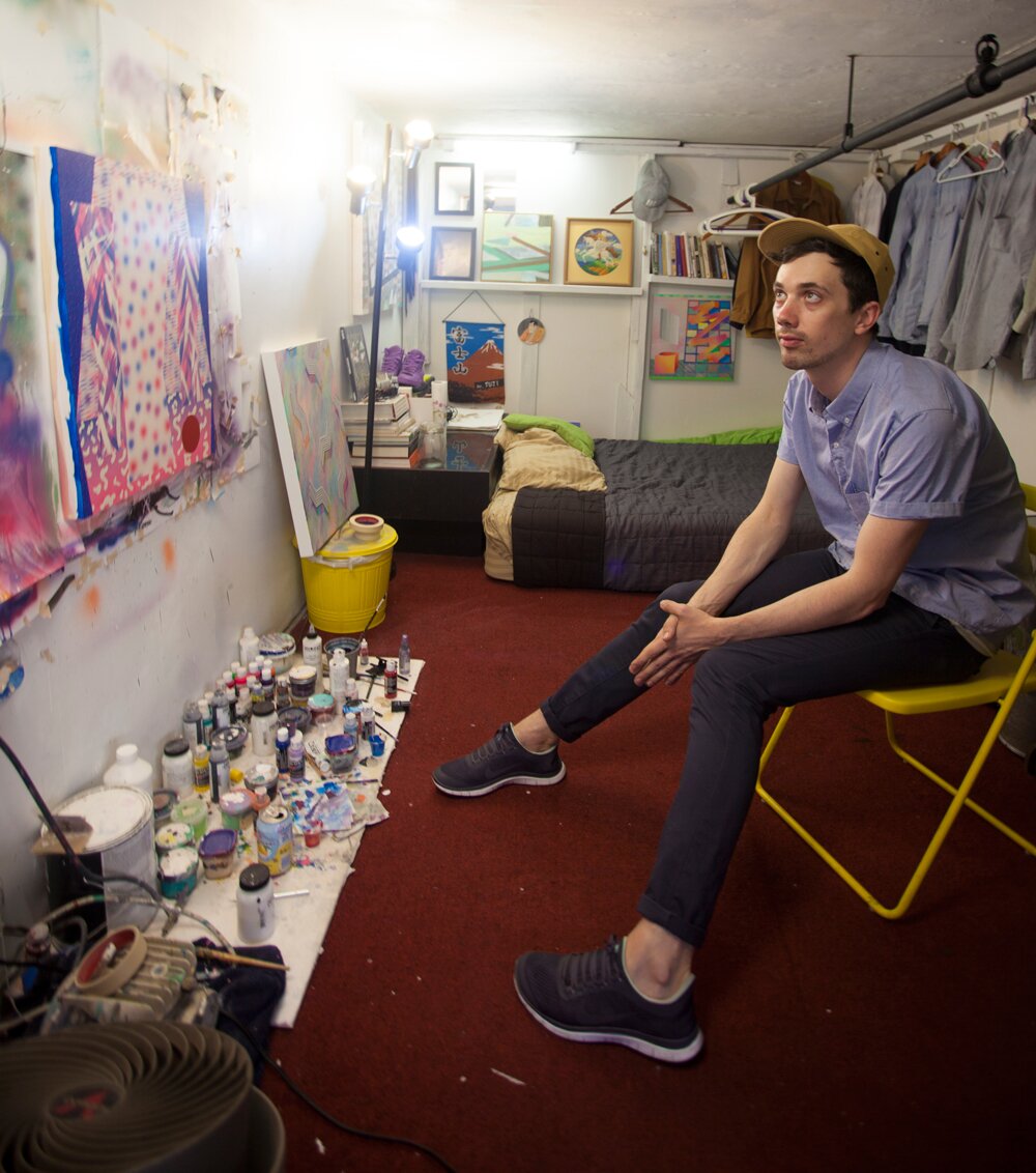
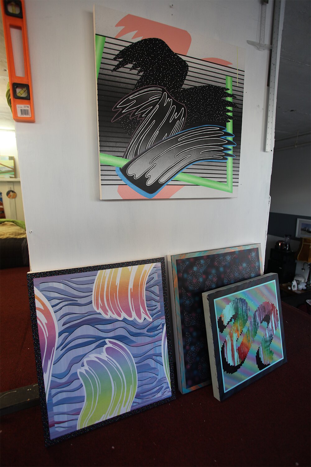
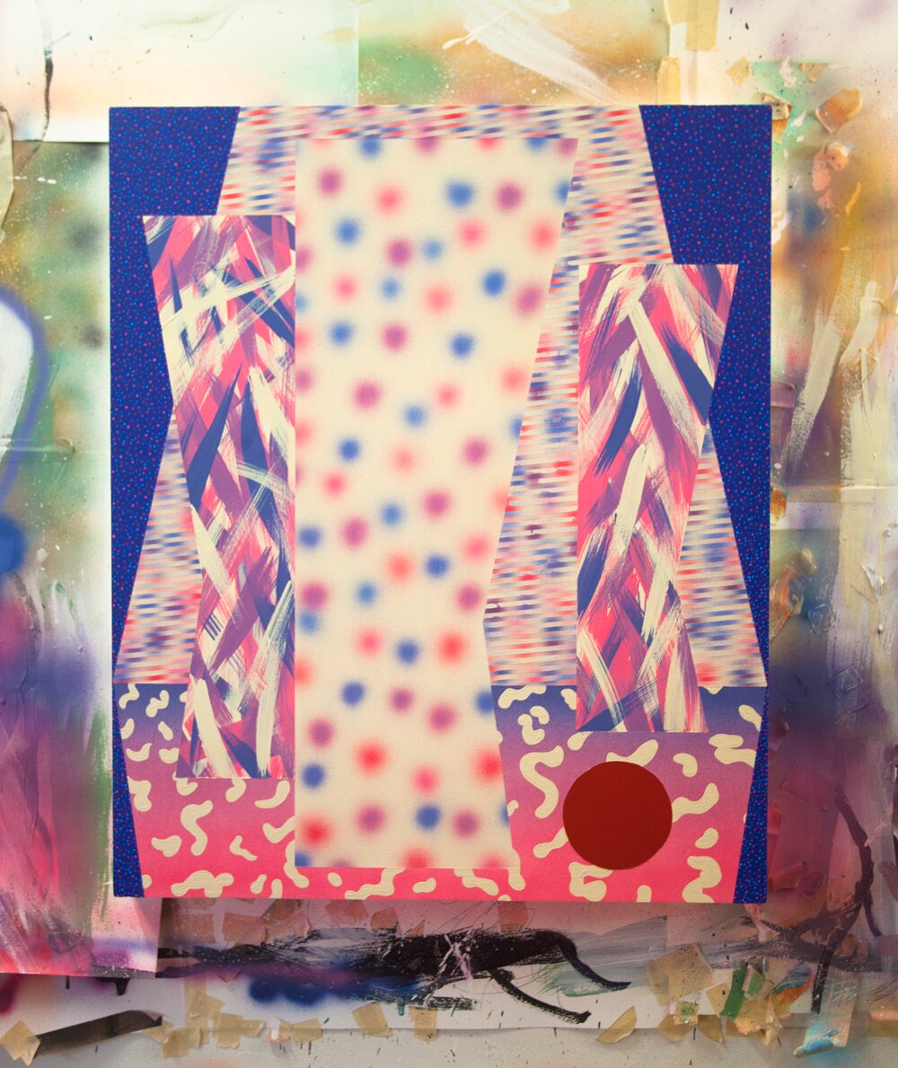
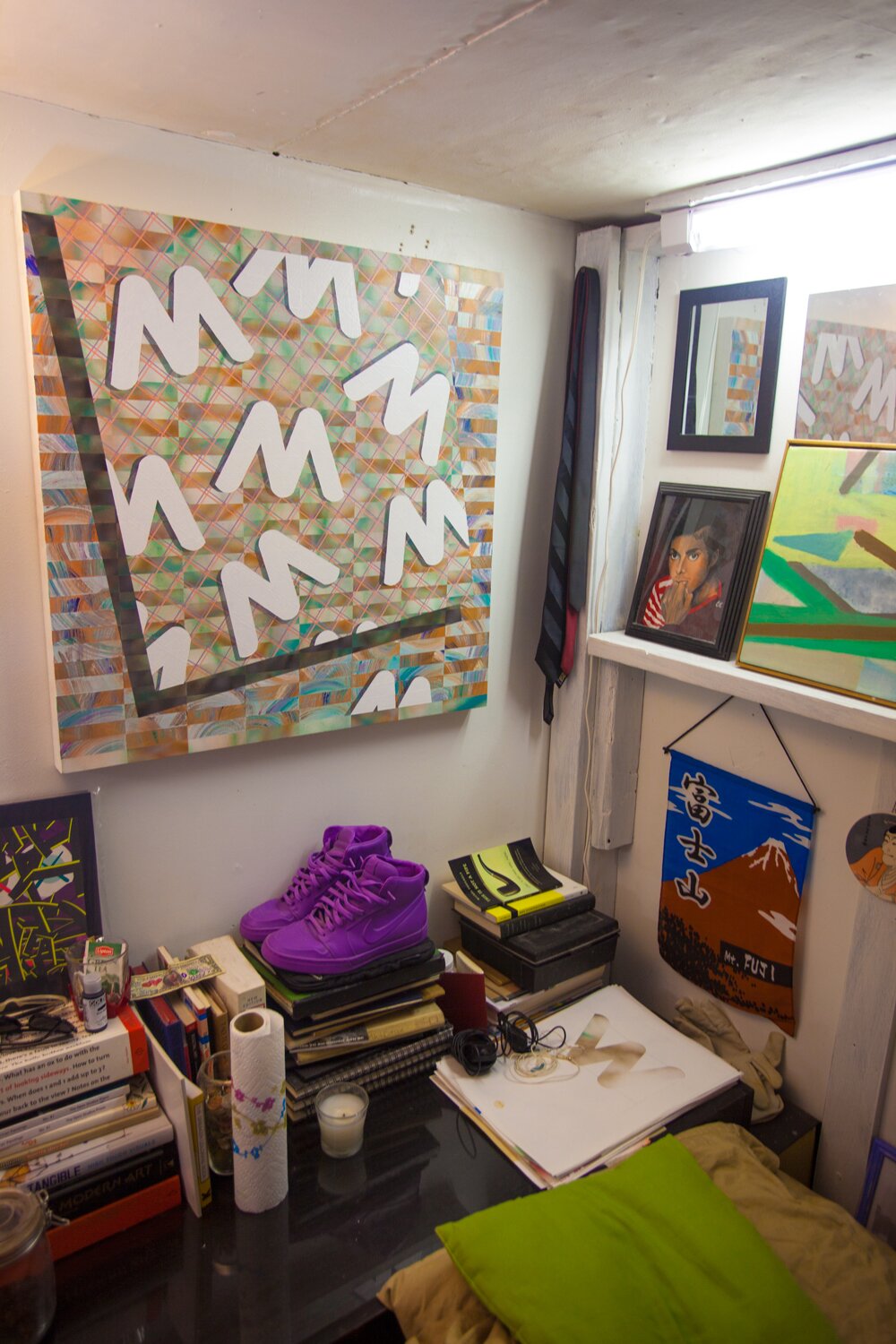
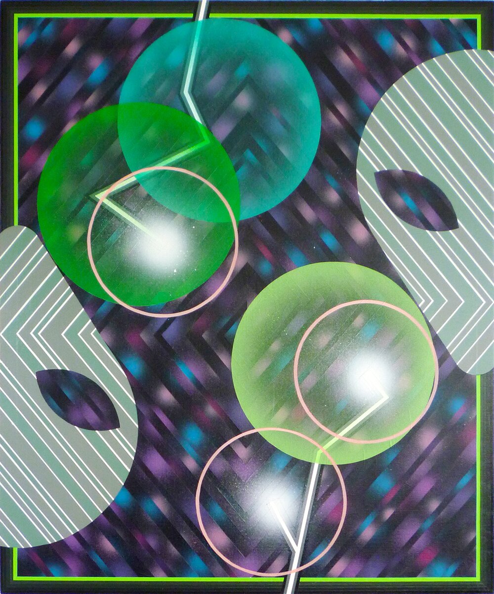
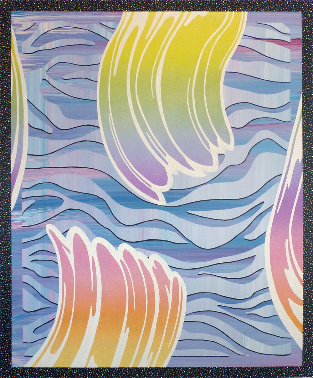
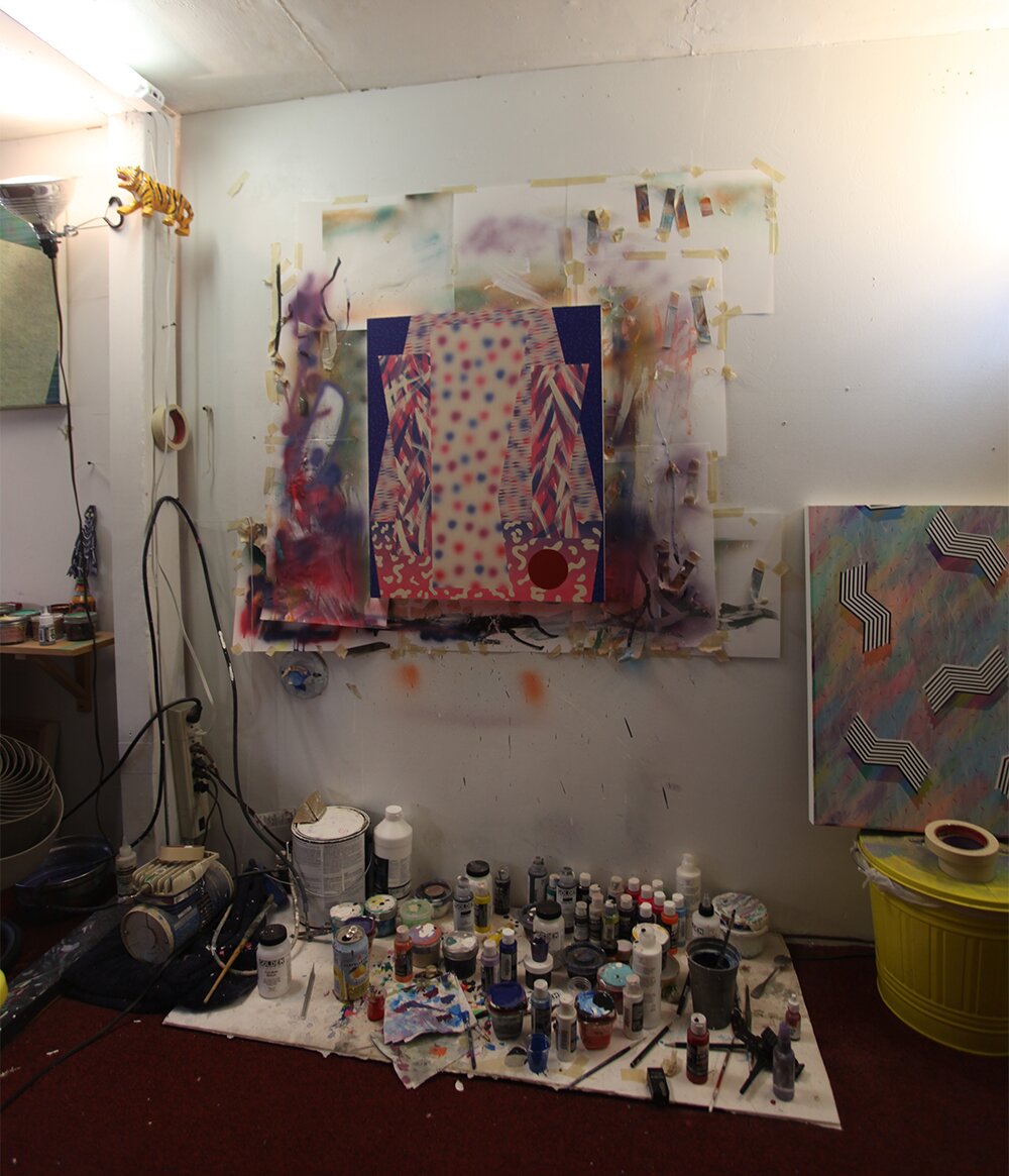
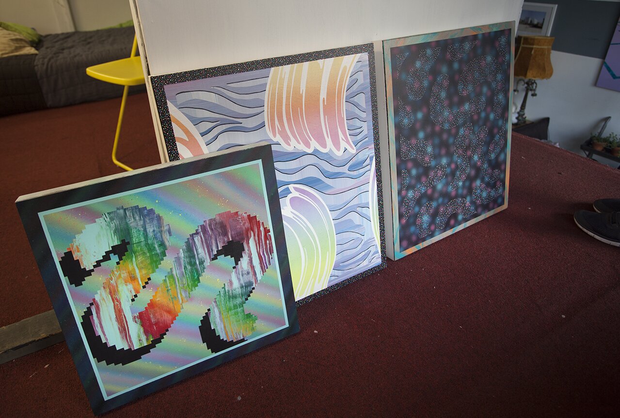
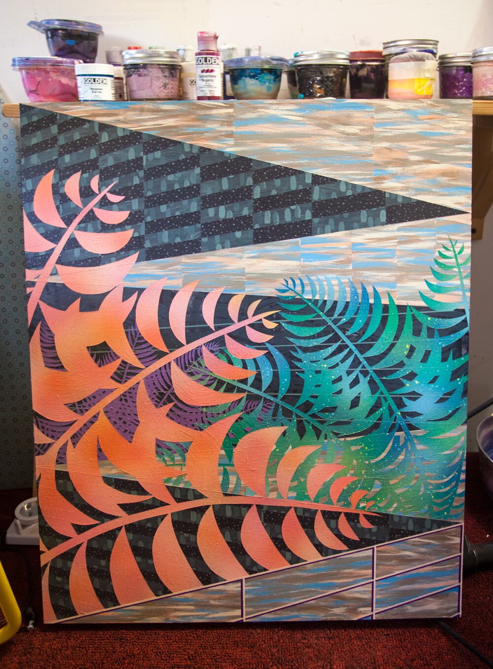
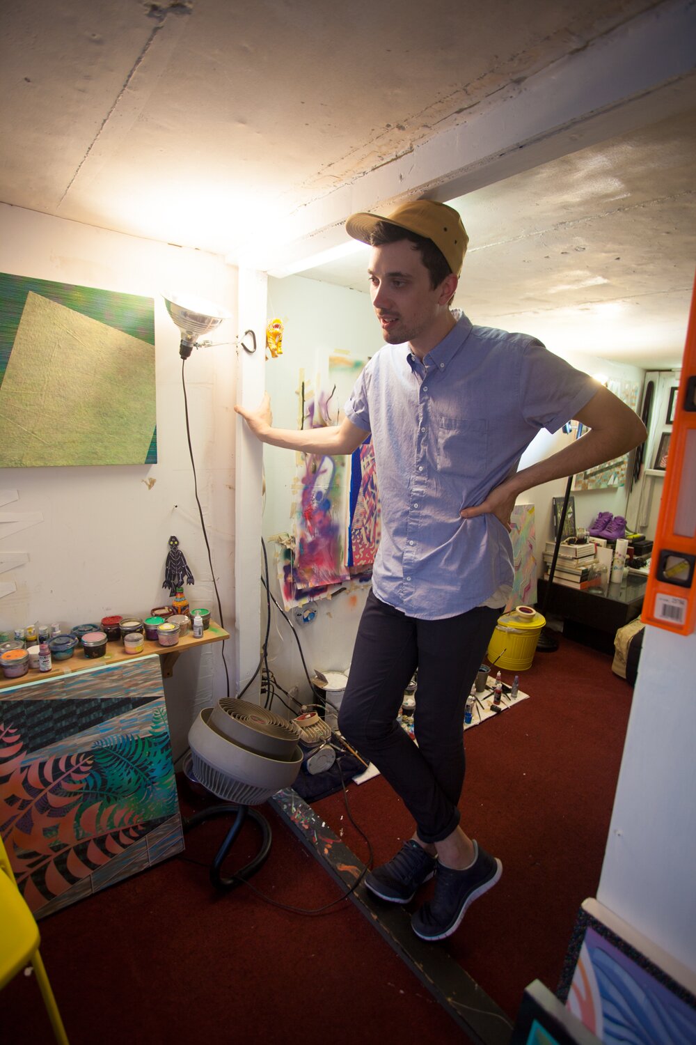
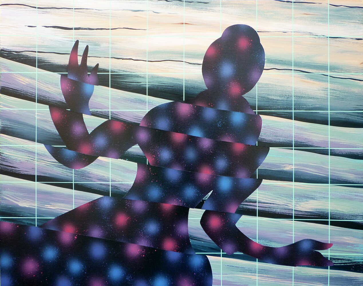
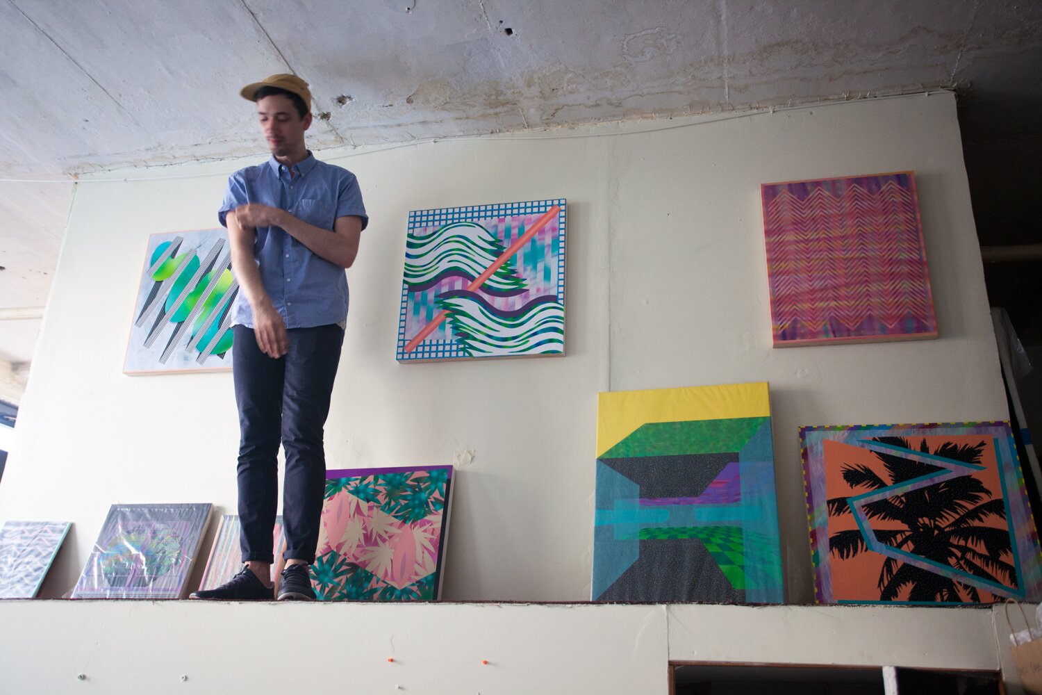
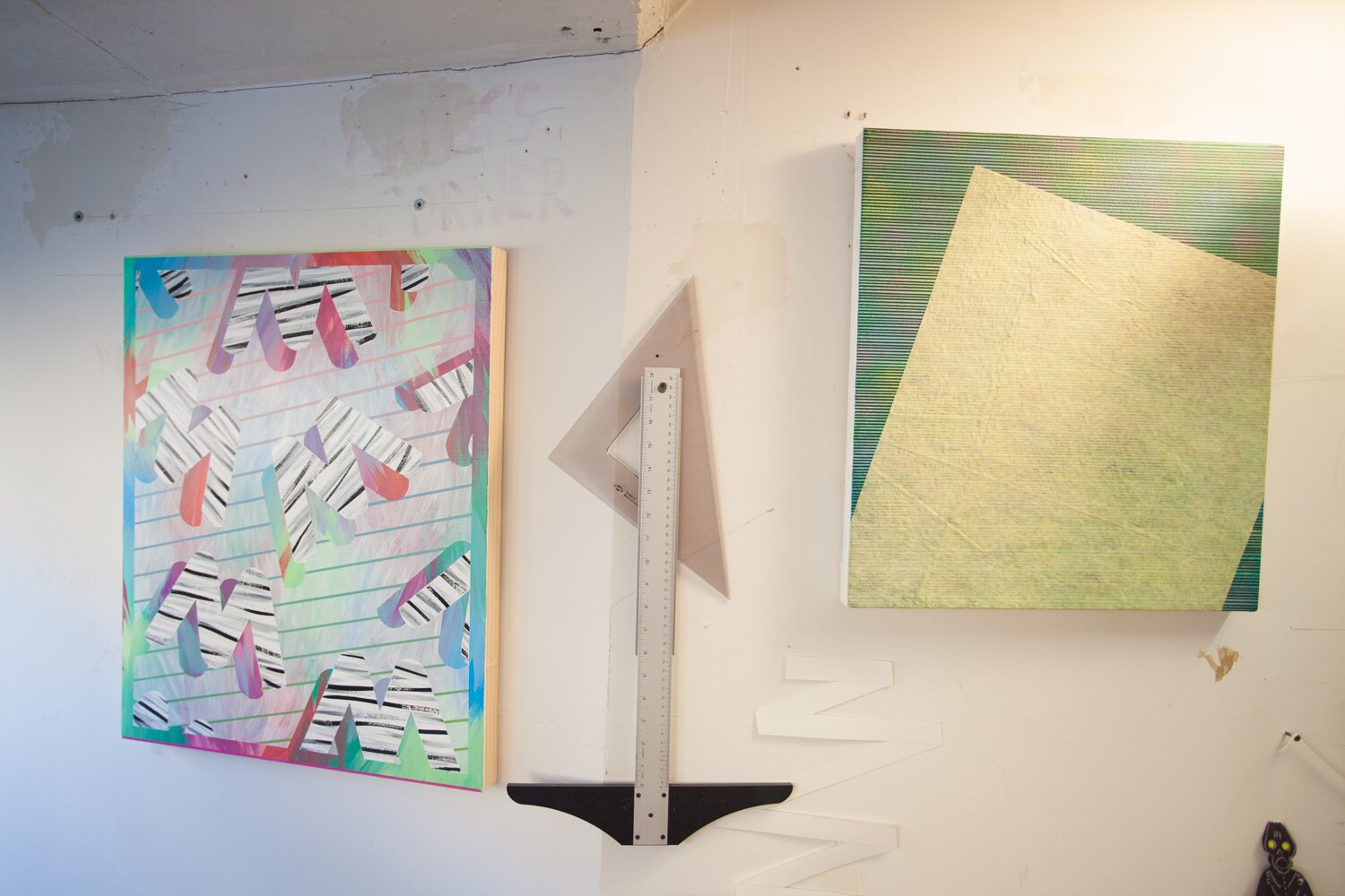
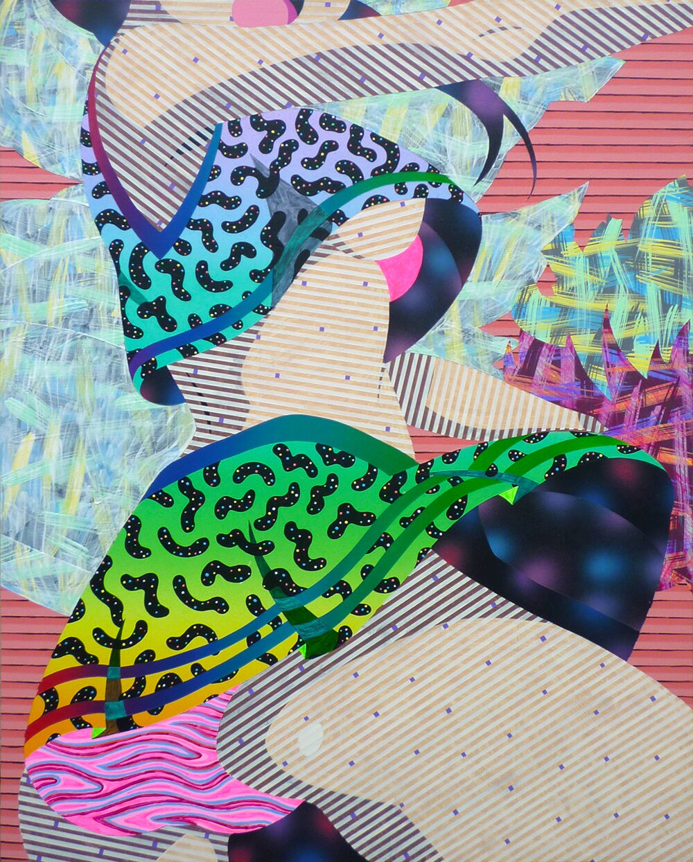
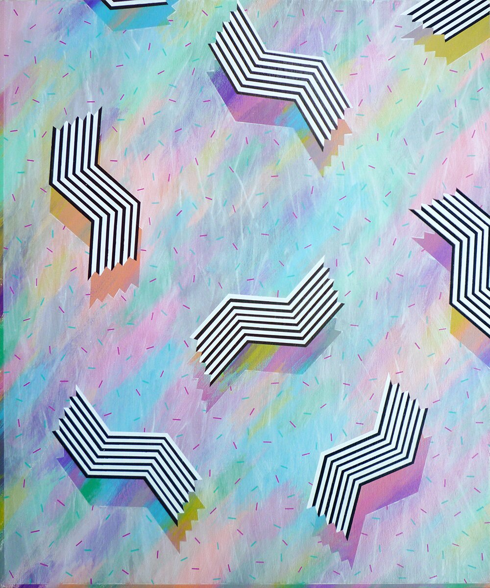
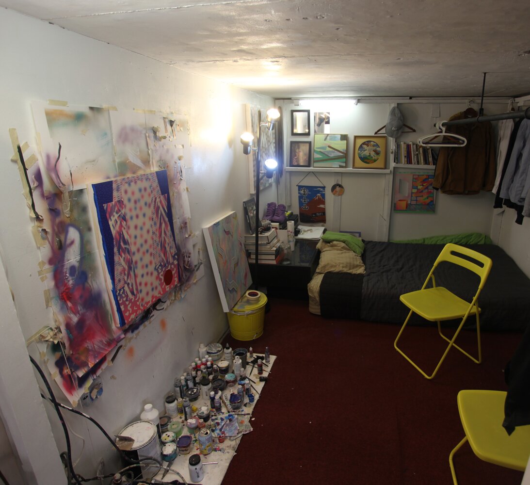
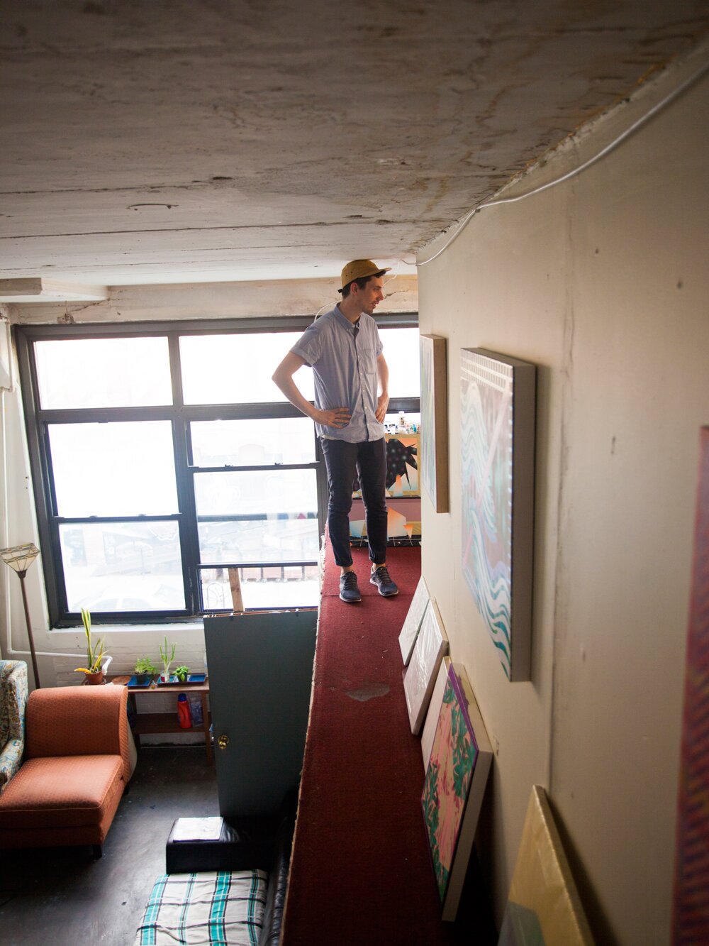
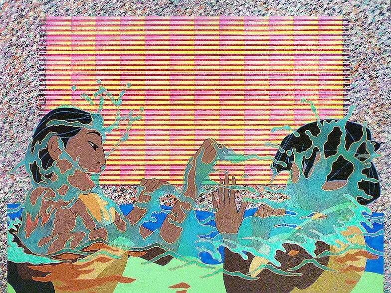
We met with Michael Dotson in his Bushwick live/work space. We climbed up to where his bedroom/studio was located in his makeshift 2nd floor of his apartment. The space was crammed but laid out efficiently for a maximum amount of workspace. Michael’s paintings touch on a diverse array of subjects ranging from alien abduction to Disney cartoon characters. Wallpaper and textile patterns reminiscent of 90′s outlet malls make unexpected appearances in bright hues. His work has popped up in a number of shows around the city including and most recently .
F: Are you more concerned with the image or the painting as an object?
M: The image. I think the object is a tool to get the image, so there is no concern in trying to make it accurate or representational. I was thinking about it as having a magic eye that automatically works for you.
F: Magic eye like a puzzle on the back of a cereal box that you give up on after 20 minutes?
M: It’s already there with no effort on the viewers part. It’s for all the kids that were never able to get it. It’s a magic eye and also when Predator is invisible.
F: Your work ranges from small to medium sized paintings. Is there a specific choice for doing so?
M: The [size of the studio] space dictated it. Normally, I would work a lot bigger than this but it’s turning out to be better because a big painting takes forever to do. When I was in grad school, I was working all the time and I made half as many paintings as I’m making now. On the Internet, they’re all the same size.
F: Where did you go for grad school?
M: American University in DC and then to Brooklyn in 2011. I came up for an interview for a job and had a duffle bag full of clothes for 3 days and ended up staying on a friend’s couch for 3 months.
F: With some of your paintings, there’s more figurative elements while in others, they are bordering on more pure abstraction. Do they all come from an object or a physical vision?
M: I view them all as abstract, even the older ones that were landscapes. The spaces have gotten shallower and shallower until they became more abstract paintings.
F: So ultimately you gave up the landscape aspect of them?
M: I gave up making them with strict perspective. I used to establish vantage points and then start building stuff in that space but now its not about the space at all. It’s about the texture so it lends itself more towards the shallowing of the space. It’s still using space a lot. I think I just eliminated that structure.
F: In most of your work, I noticed that you have these framing devices.
M: Yeah, ever since I read this book, “The virtual Window”, I’ve felt that it’s just all about the idea of a window. I used to make perspective paintings. After reading that book I realized how paintings like that references a window. Also it relates to the human body more and just thinking about painting as a kind of framed view or something. The frame comes in just because of that ‘just captured moment’ but it’s contained within that structure. There’s nothing more there.
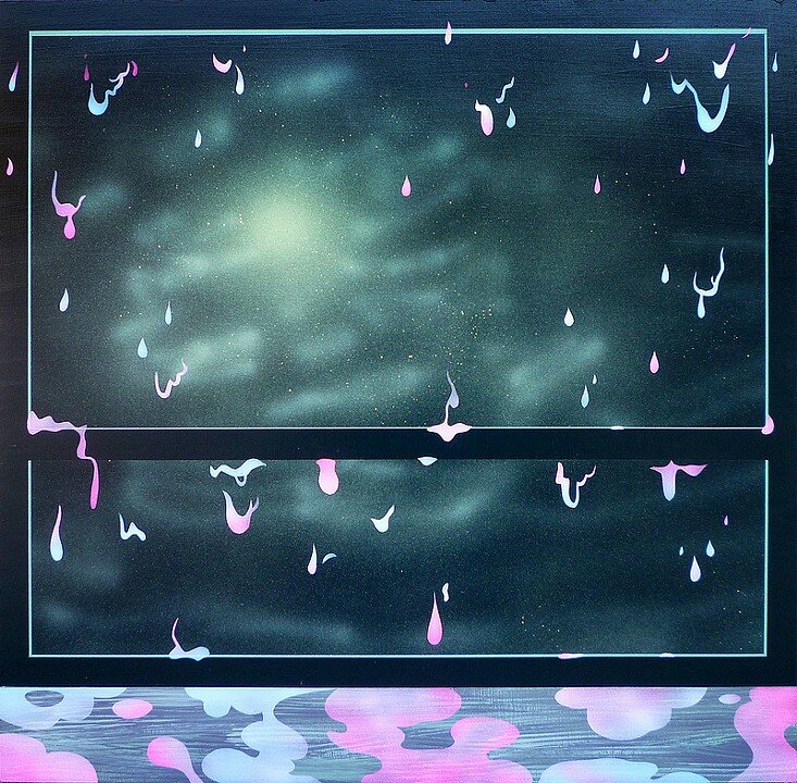
F: Yeah you can look at the surface with these textures but then you have to view it looking in.
M: I think the frame draws attention to the flatness of it.
F: That’s interesting to me. I almost find it more true with the ones on panel compared to the ones that are on stretched canvas. I start to think about them in that framing effect from looking at the materials.
M: I think it just had me thinking about paintings as windows and it’s hard to say specifics, [but] it changed the format of my paintings. It had me thinking about framing and got me away from landscape format. I also got more into squares. It’s more neutral and it doesn’t reference anything else.
F: Yeah, it’s not defined as a portrait or landscape.
M: This book’s funny. There’s a lot of funny things in there. People just started flipping out when people started making windows in houses that weren’t in a portrait format. It was a huge debate. And then there was a time when there wasn’t a standard aspect ratio for movies. Every single movie was different and they were convening to come up with something. This one person proposed that movies should be in a portrait format.
F: Thats great! Like when people shoot video the wrong way on their cell phones. That’s amazing!
F: It seems like you’ve come up with these different vocabularies that come in and out of your work.
M: Yeah, I like to come up with something and repeat it a lot. These originally came from a long ass time ago when I was making a stadium and made people and signs and I really liked it and kept using it. I think it’s funny to paint dots.
F: They remind me of beads on a dress. A lot of these textures and color choices seem textile based, like they exist in some mall in north america in 1995. This reminds me of my wallpaper in my childhood house’s bathroom. It is totally that exact wallpaper.
M: I can see it as a textile on a couch in the 80′s and then these were from a tabletop in a chinese restaurant. I like looking at that kind of stuff. You just look at it and ask who the fuck designed this? Anything goes. This one painting I titled ‘Magic Johnson’s The Movie Theater’. It’s like that could potentially be what a carpet could look like in a movie theater.
F: It’s all weirdly familiar in a nondescript type of way. By taking away the context, there’s something sinister that happens. You remember it but you don’t know why.
M: Yeah, I don’t know how that happens. Maybe living in Cleveland for so long… It’s just bright as hell. I think it’s appropriate that dayglow comes from Cleveland.
F: It’s interesting looking at that large one out there that makes me understand the smaller new works. You built a world out there in this 3D rendered – almost like you went into a 3D program and made the world and then painted from it. But with these, you’re using the different marks and with the window framing devices you’re making your own world without having to use that space.
M: I would like to have it where I didn’t have to talk about virtual reality every time I had a studio visit. I was always trying to make those paintings where there was an illusion that was broken by other things so there was never actually an accessible space. It could never be real. I guess I’m doing it with these. It’s just that I think that’s what every painter is doing. They’re just enjoying how painting can be flat surface and a special device. That’s probably the biggest interest for me.
You can see more of Michael Dotson’s work at

