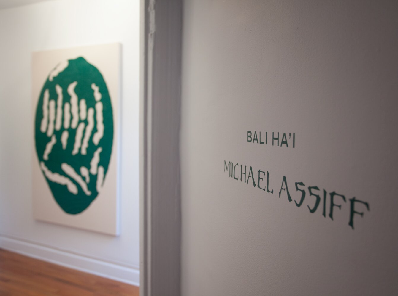
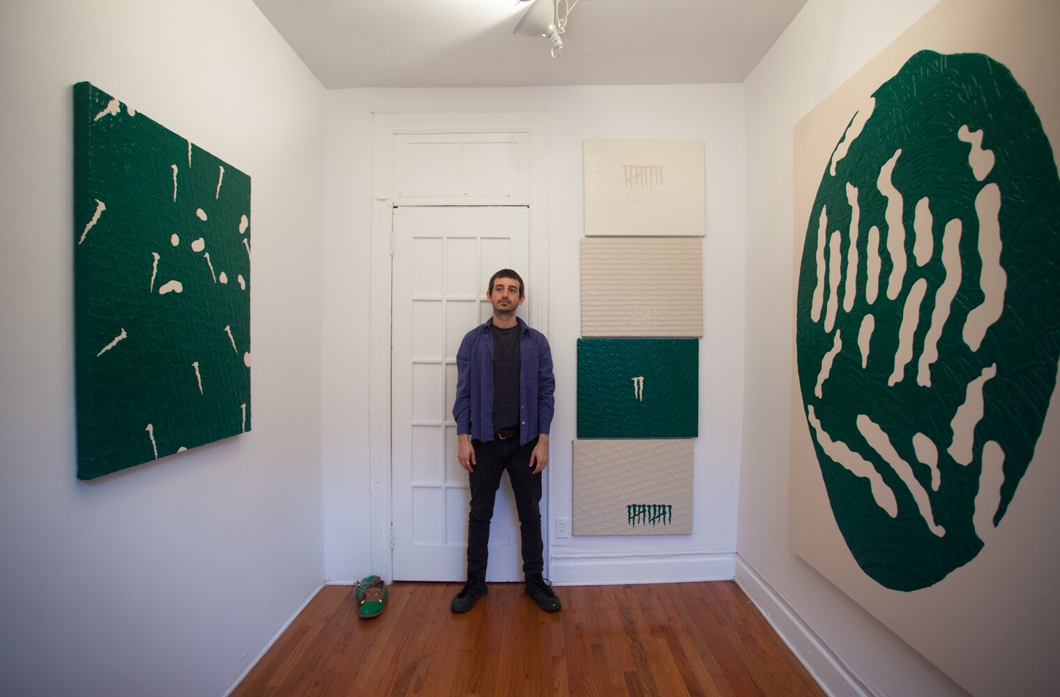
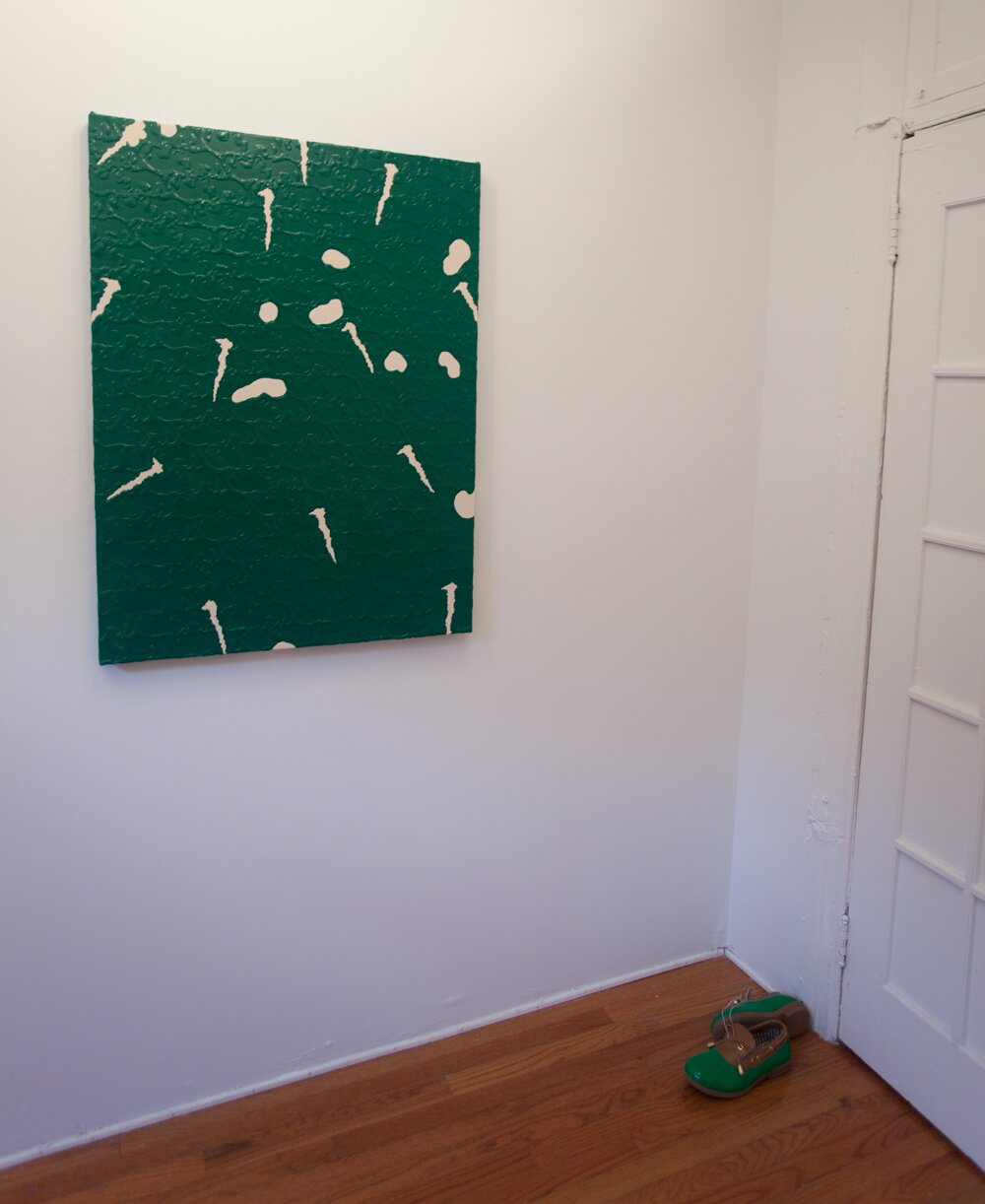
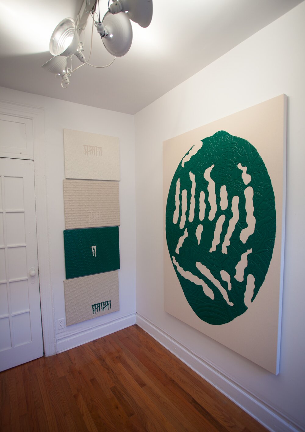
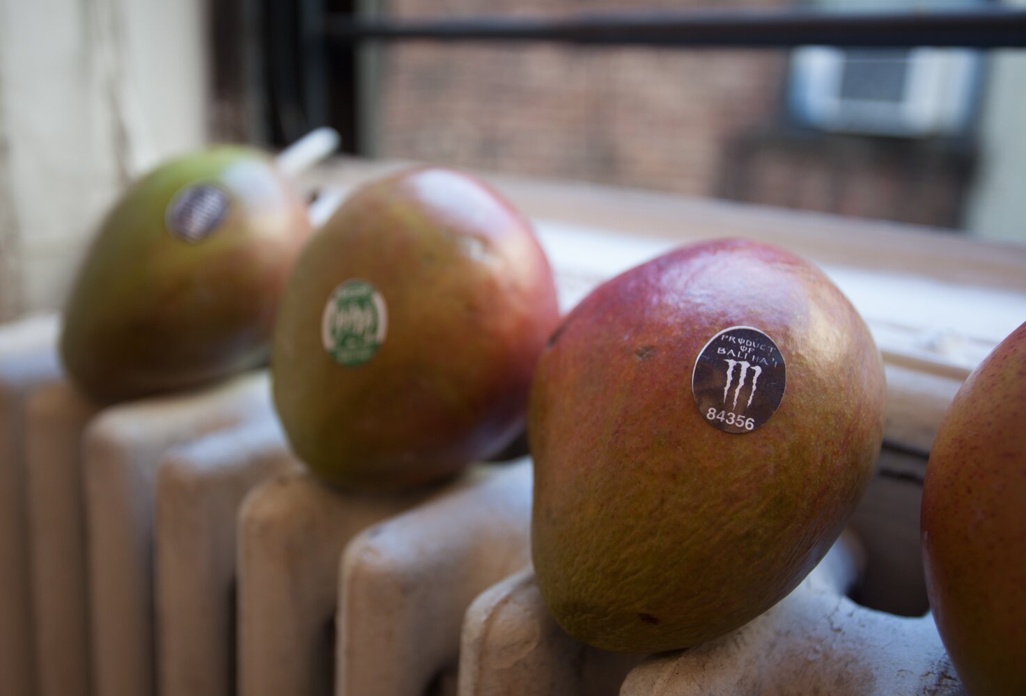
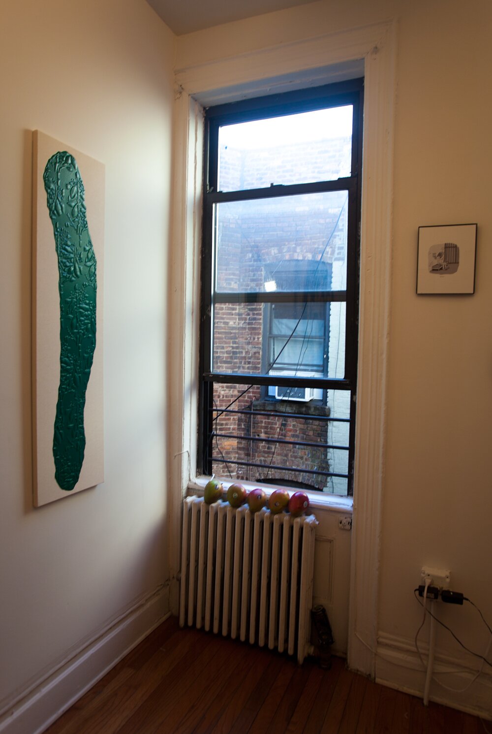
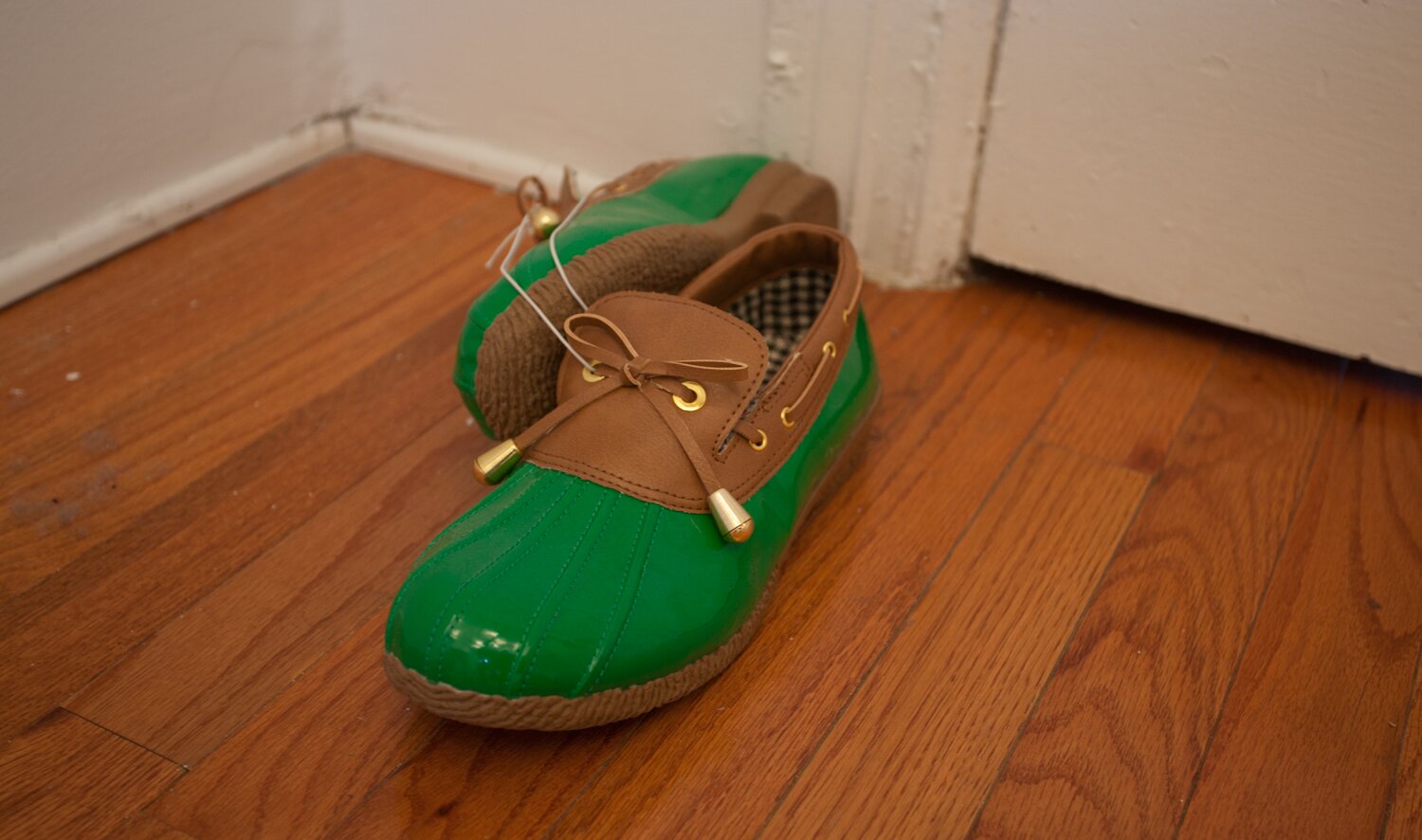
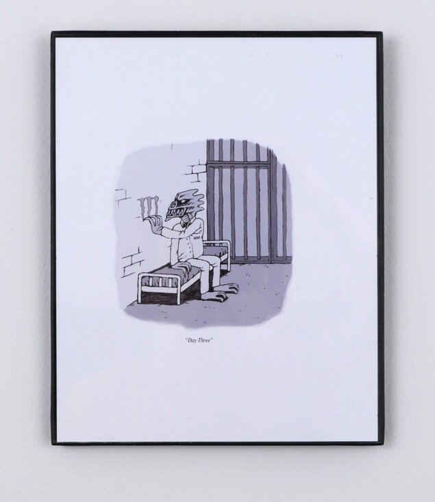
We met with to talk about Bali Ha’i, his current solo show now up at the . Green monochrome paintings fill the room alongside small prop items which seem casually placed within the space. Four large paintings face each other while a series of extinct animal pattern paintings are hung stacked vertically on the third wall. Found in the corners of the room are five mangos with various labels marked Bali Ha’i, a Monster Energy drink can, a pair of green plastic shoes, and a New Yorker type cartoon that hint at the dialogue between the paintings and the objects.
The slash marks found predominantly in his pieces are directly inspired by the logo of a Monster Energy Drink he found in the jungle of Costa Rica. Within the gallery space, a physical Monster drink can is “littered” in the corner beside the heat furnace, working as a literal reminder of his inspiration. Assiff’s larger pieces are influenced by the jungles of Costa Rica and the perfectly manicured lawn of Bali Ha’i, a Vegas golf course and resort of which the show is titled after. His work plays with the contrasts between the natural plant imagery found in his paintings and the green plastic synthetic coating he uses to cover the surface.
Bali Ha’i is on view until November 10th at the which is located at 163 Starr Street #4L in Bushwick, NY. Open only by appointment.
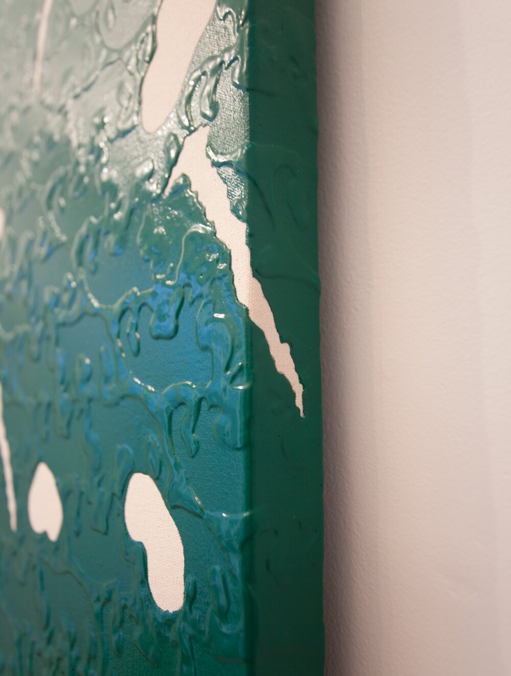
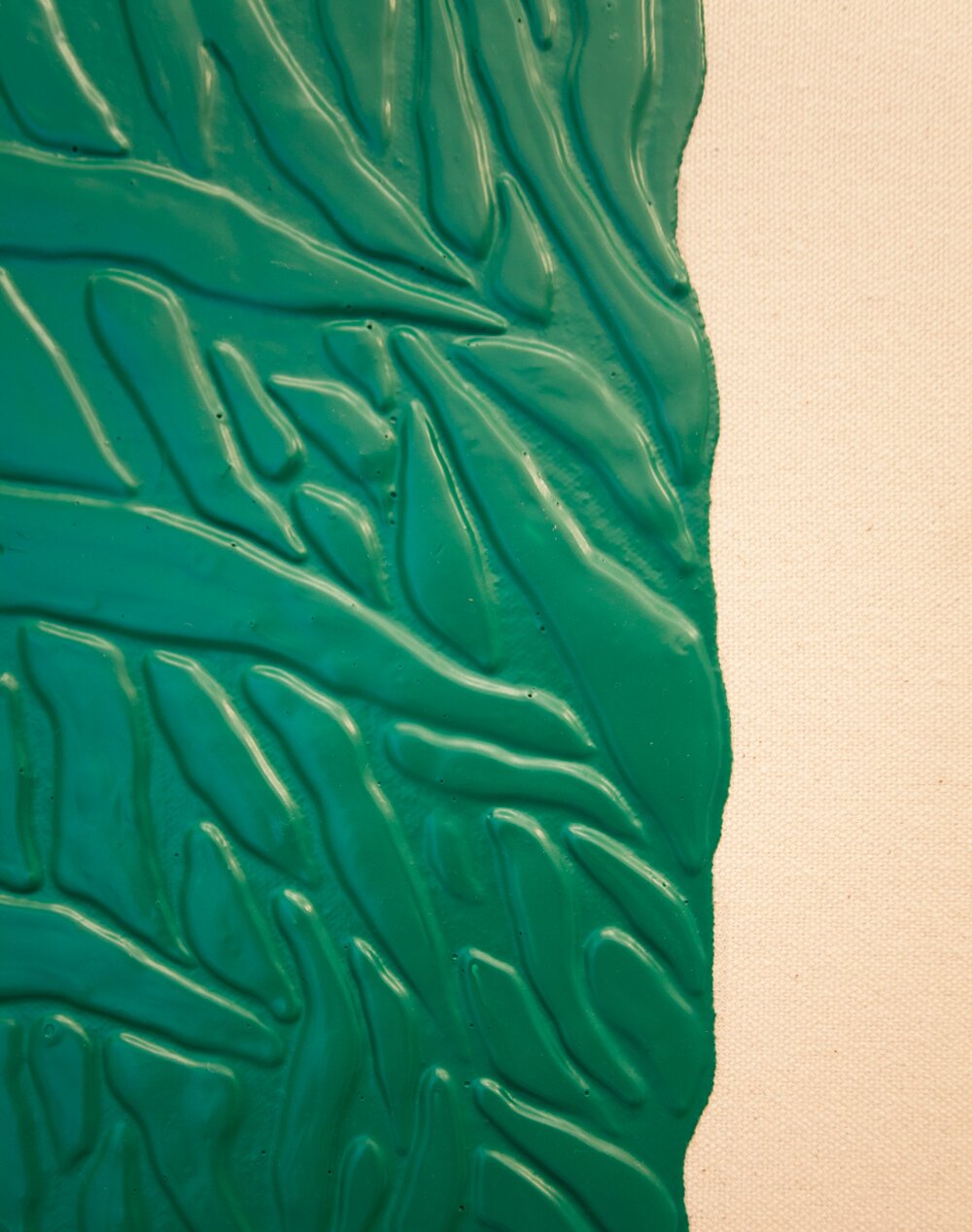
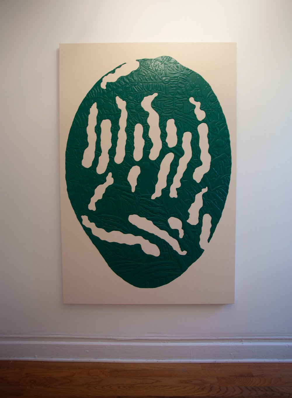
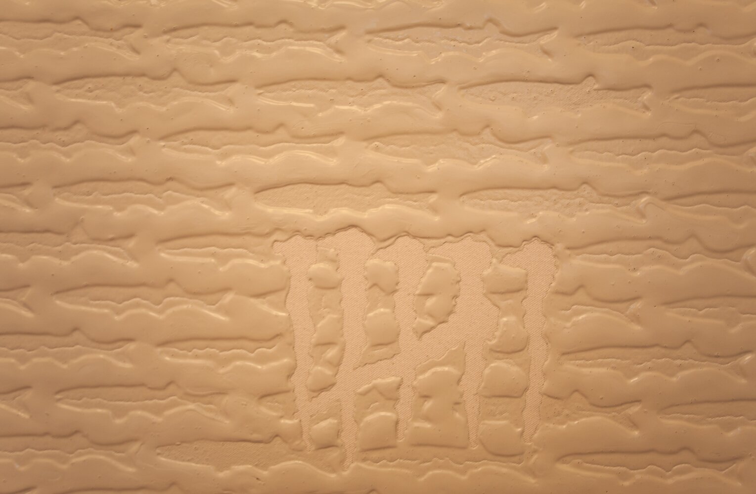
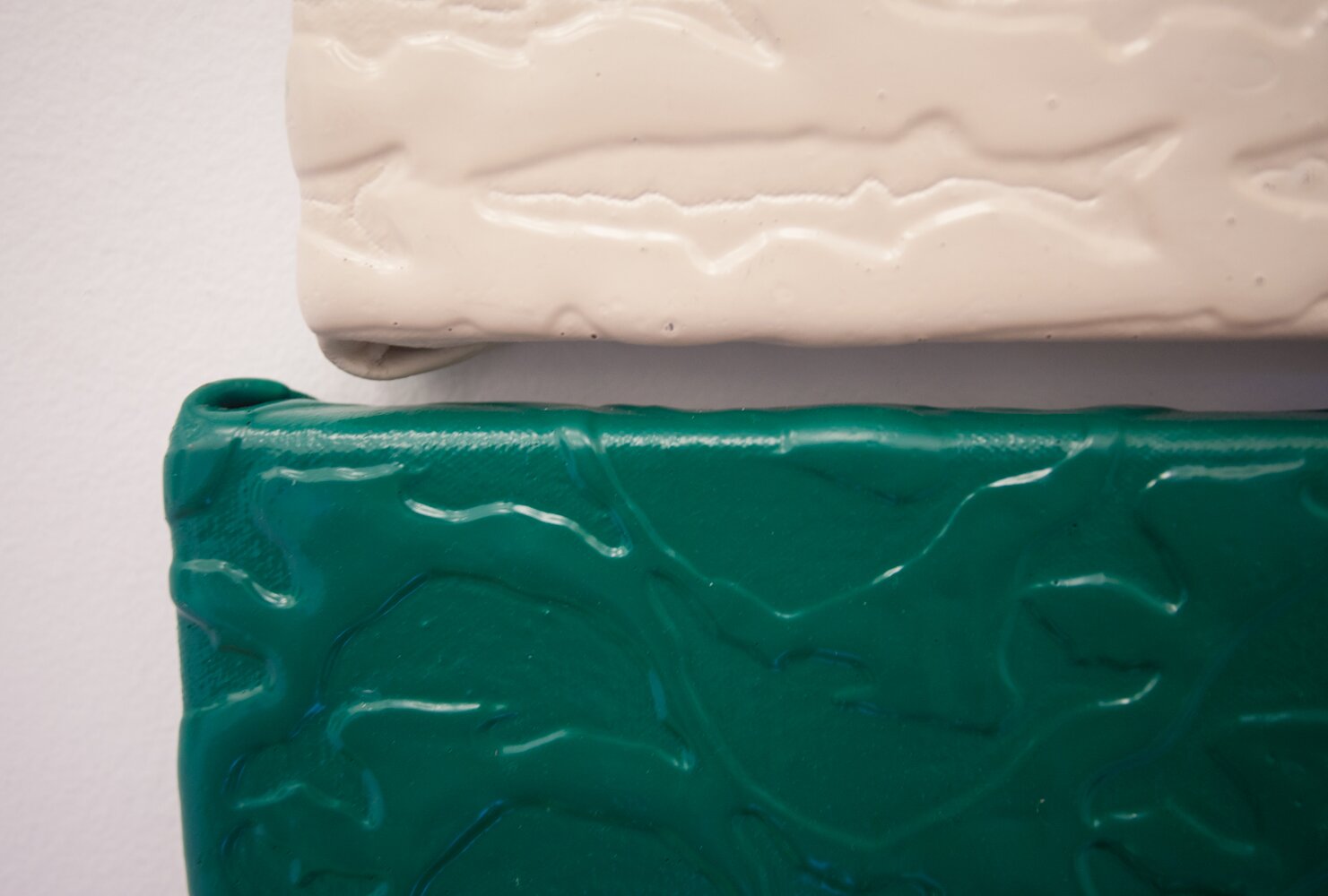
F: At first glance the paintings appear as though they are simply poured on and the image is being organically created. Only upon closer inspection, you realize that the organic pouring is a ruse. The relief is carefully and meticulously rendered by hand using the plastic material. Can you talk about your process and the organic read of the image versus its calculated creation? Also, the decision to depict the natural world in a green plastic manufactured looking surface is an interesting choice. Can you talk a little bit about that?
MA: I will admit I have, which I think is pretty common, both a wonderment and a deep repulsion to plastic. In practice I try my best to avoid touching it, eating out of it, strapping it to my body. But I felt in order to talk about environmentalism in painting, I had to create a type of thing that could contend with the type of objects that are being produced by the systems that are so engaged with environmental exploitation – petroleum and plastics. So the short of it is that I seek to make a mass-produced continuous plastic surface that not only depicts but embodies the layered reality of manufacturing, land-use and nature.
But yeah, I am still a “painter” and I will continue to have these humble means of production that I use to interrogate this large scale subject matter. I think it is important that I am harnessing this “made in china” language while standing in my studio in Brooklyn. I guess I’m interested in what happens when you find out this mass produced looking object is one of a kind. Like the way paintings are historically supposed to be one of a kind. What if we all drove one of a kind cars? Texted with bespoke cell phones. But I should say friends should be relieved to know that the materials I landed on are non-toxic and I’m hopefully not gonna die like those 70s West Coast resin painters.
F: Earlier, you mentioned that you were influenced by your recent trip to Costa Rica, can you talk a little bit about that and how you landed on the Monster logo imagery in your work?
MA: I stayed in Costa Rica with some friends that run a yoga / surf retreat called the Yoga Farm. It is stuck right where rainforest meets the sea in a microscopic town that is close to the Panama border. I had brought watercolors and pencils and my smart phone which has a camera in it. But I felt these were extremely reductive ways for me to engage with the rainforest. I instead spent days walking the beach collecting sea plastic.
What fascinated me was that Monster Energy Drink, or the logo rather, is really popular in among the Ticos – that the local people are making their own Monster logos and sewing them to their clothes, painting it onto their ATVs.
There is something loaded about the violence of the three slashes, about the green glow. Its like on one hand its some dark forest beast spirit, yet on the other hand its this western agro kind of thing. When I was there I had a lot of conversations about deforestation. I mean its naked to see, these pastures, these clear cut cow pastures with these sick skinny cows. Apparently no one has a clear idea about why the cattle are not thriving down there. But the monster slashes became this metaphor for slash and burn, clear cutting.
F: Your work is very monochromatic and neutral except for this particular shade of green. It’s very prominent in your work. How did you land on this color?
MA: I looked for a ubiquitous shade of green that would not draw attention to any particular variation of its warmness or coolness. I wanted a green that is closer to a noun than an adjective. I guess I write about the green being an average of garden hose, john deere tractor and MTA green. Also USDA certified organic green. These things were all in my mind when I was mixing this green, but in the end I sort of just cleared my head and did kundelini yoga and drank green tea and then it came to me.
Also just to say out loud “I make green plastic paintings” creates a sort of linguistic content that speaks to the content of my work – you know, its about the way the word “green” is used these days.
F: The negative space left through the absences of the green paint is reminiscent of a topographical map of lakes. What role does the idea of maps play with your paintings?
MA: So I started with the big Henri Rousseau paintings. I was copying Rousseau’s landscapes pretty faithfully except for the animals and people. Where these creatures appeared I would leave blank allowing the canvas underneath to show. The paintings began to appear as land masses with these subtractions being bodies of water. In the new paintings these absences are planned using golf course maps to determine the negative space. The blank spaces being the fairways. To me, this kind of land use is highly aestheticized deforestation. I am embarrassed how intrigued I’ve become with golf course design. Its really beautiful the kind of shapes that are used.
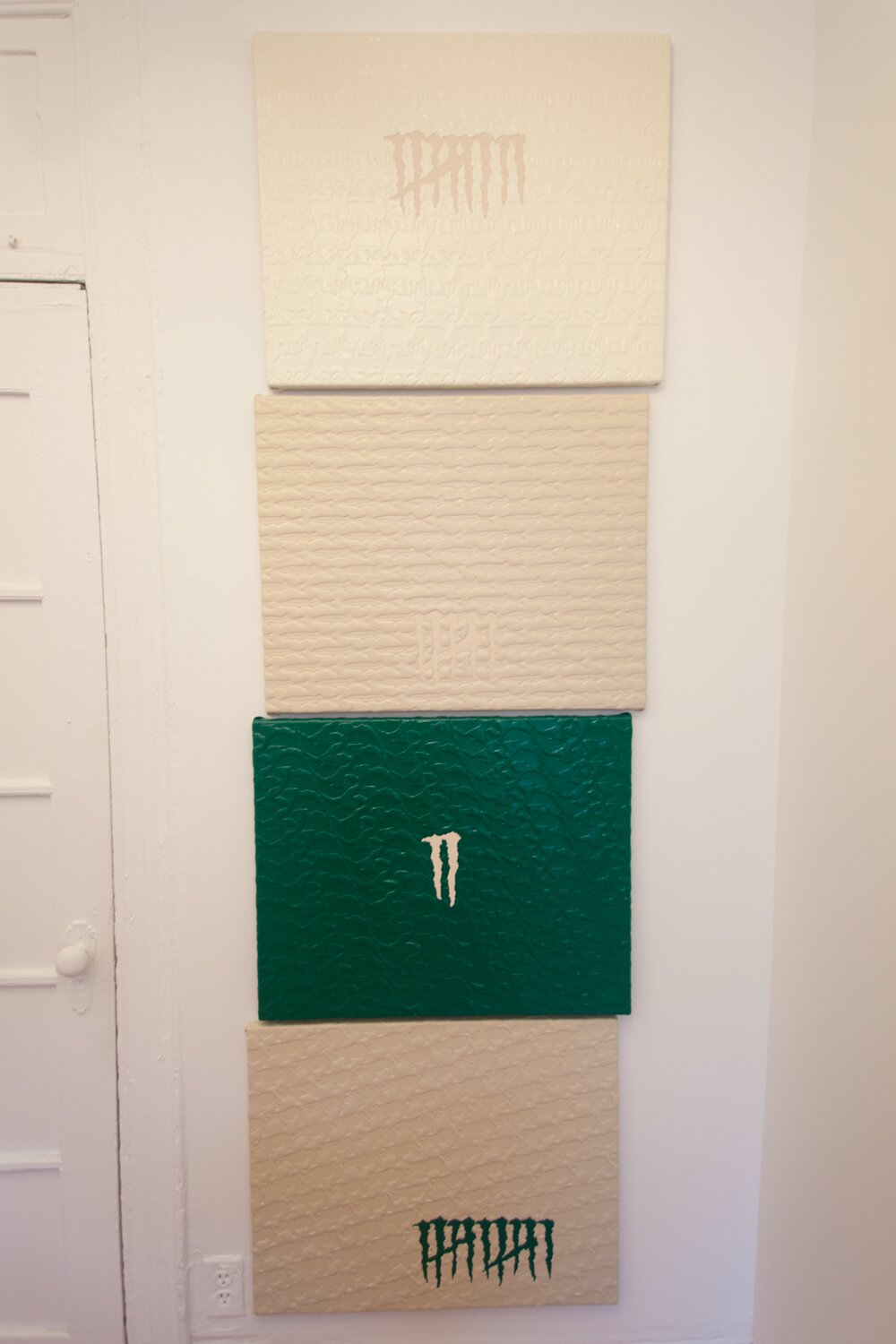
F: The way the extinction pattern paintings are stretched, enveloping the surface and bunching up in the corners, draws attention to the plasticized material and I see them more so as objects than paintings. The addition of the repetitive animal patterns and prominent slash symbol start to draw ideas of textiles, logos and branding. Can you describe your feelings of these paintings as objects?
MA: The extinction pattern paintings definitely take heavy cues from designer handbags. I was looking at this green S/S 2013 Louis Vuitton handbag as inspiration. I went to Macys to hold a LV bag in person. I had never handled one before, and I was worried these paintings I was making weren’t luxurious enough. I was actually a little surprised on how the bags feel. They are much cheaper feeling then I thought they’d be. I also found out from the salesperson that the bag online that I’d been referencing was a knock-off and that LV didn’t actually produce bags in the brilliant green color.
The pattern paintings are actually very top heavy conceptually. Each painting’s pattern motif is from a species of animal that went extinct in the the year of the painting. The year of the painting is indicated by the number of monster slashes. The shade of color and the title beginning in A/W or S/S refers to the time of year the species was believed to have perished.
F: Most of the work in the show takes the pretty traditional form of a painting on canvas. The addition of the mangos with the ‘slash’ logo labels, the Monster can, the commissioned New Yorker cartoon, and the green plastic coated shoes work as physical objects hinting at your sources of inspiration. What was your approach to setting up the show and choosing these specific pieces and objects?
MA: I think that as a painter working with such a specific vocabulary that I have the responsibility to provide clues to the audience. Yet I am completely aware that there is no way at the audience arriving at the same meaning that I had in mind. Also, it is important for me to have “the work” live along side non-art objects as well as objects created by other artists. I’m just a bit wary of the solipsism of one isolated vision. I hope populating the gallery with other kinds of objects may force something I can’t completely control into the conversation.
But to be more specific about the mangoes, they have altered produce stickers that refer to this fictive island that the Bali Ha’i golf course painting also refers to. That is about the fiction we imagine about the country of origin when we buy produce.
I hung a New Yorker cartoon that I had my friend Clay Schiff draw with the Monster in jail counting the days by scratching into the jail cell wall. The idea was that it would, in very illustrative terms, describe my appropriation of the Monster slash as tally mark, counting down to extinction!
F: What are you currently working on? Are there any future projects in store?
MA: Yeah, I’m starting work on this show at . I am thinking about portraiture, the psyche, stress balls, clocks, anxiety, etc. The show is opening on Valentine’s Day so it has to have some romance. Whether that’s the romance of anxiety or alienation or whatever. I’ve had really intense protocols on how to make art about landscape and animals with plastic. I want to find out what language I can use to represent people and time. I don’t know, it could all change but that’s where I’m at now.
I’m also working on a two person show with Sterling Wells. We have some shared interests in nature and landscape and plastic. The show revolves around this historical site in our shared home town of St. Petersburg. This site has all of these indigenous peoples’ mounds and is said to be the place Panfilo de Narvaez landed in the 1500s to colonize Florida.
Bali Ha’i is on view until November 10th at the
You can see more of Michael Assiff’s work at .



Pingback:
Pingback: