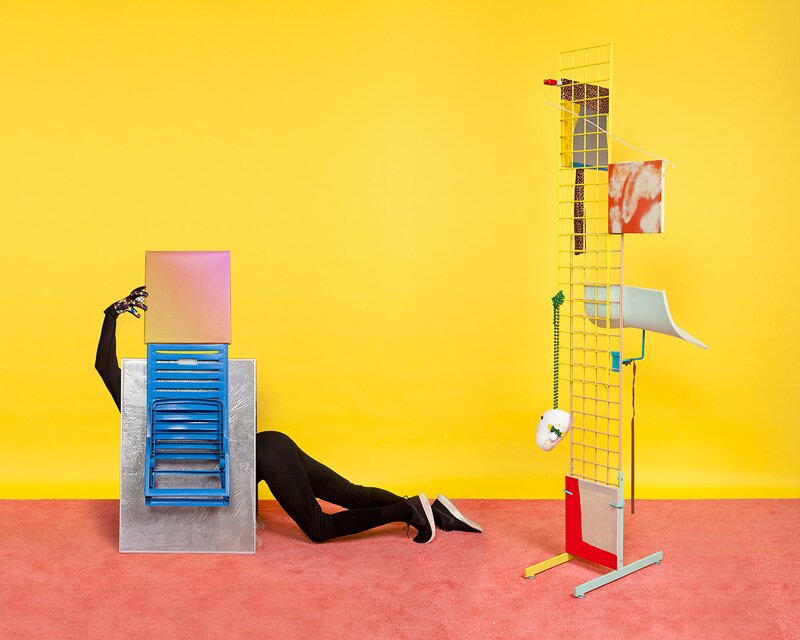
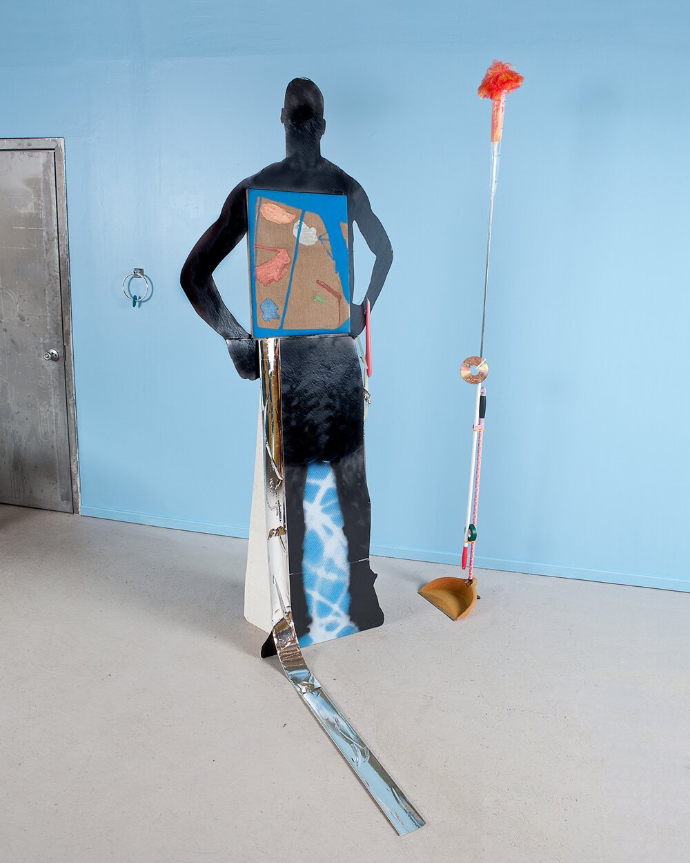
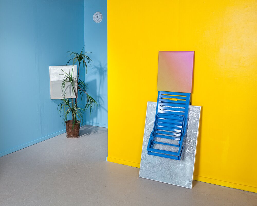
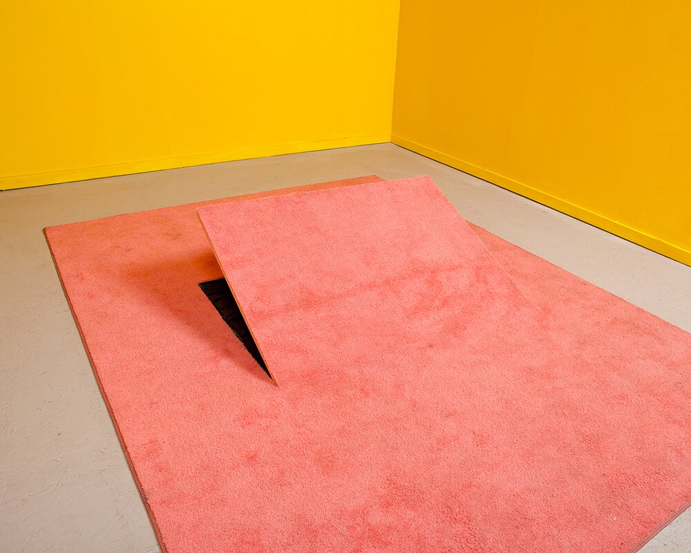
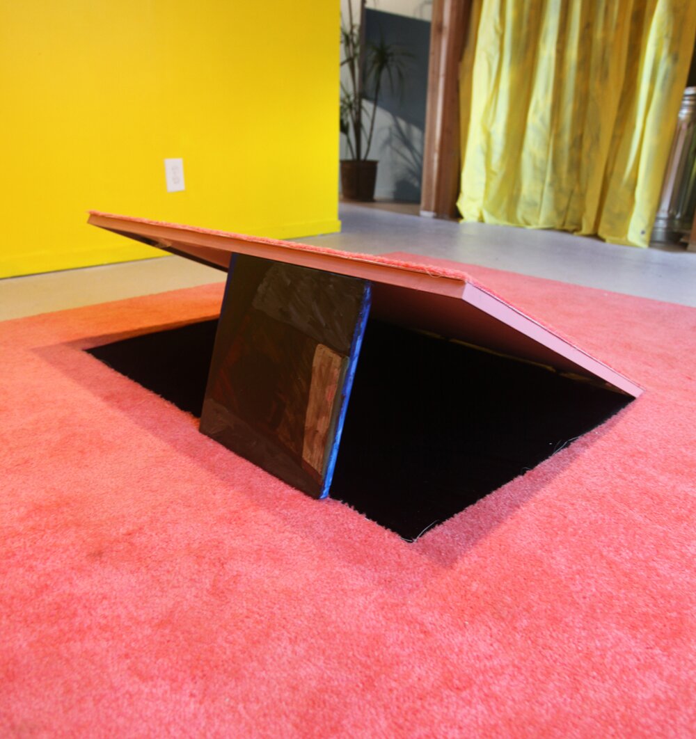
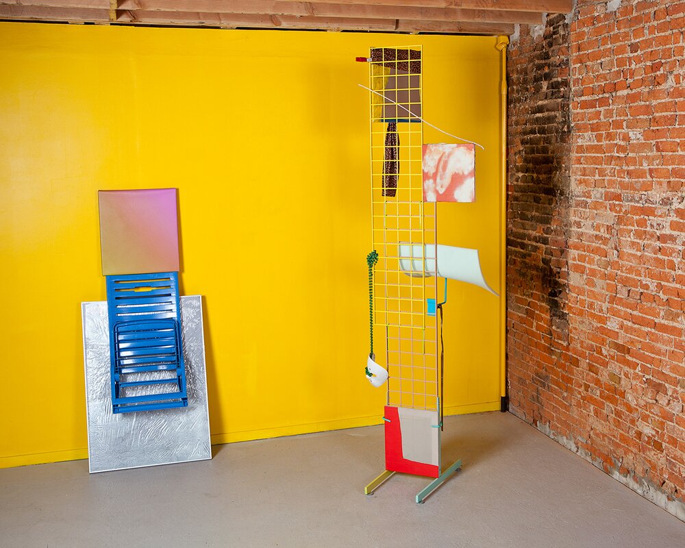
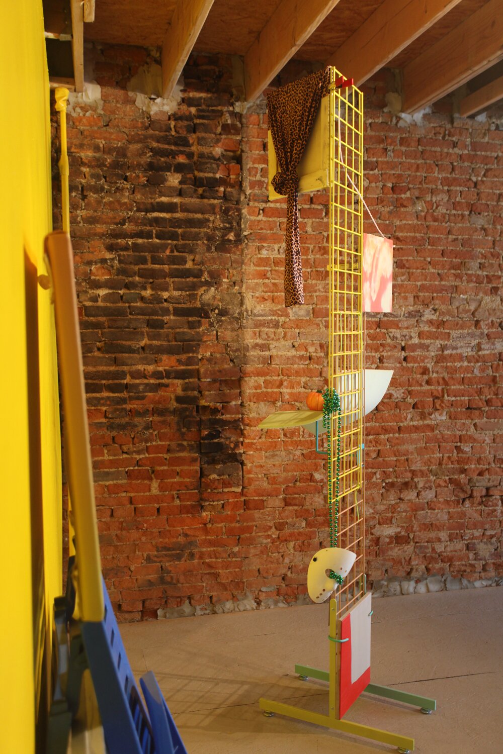
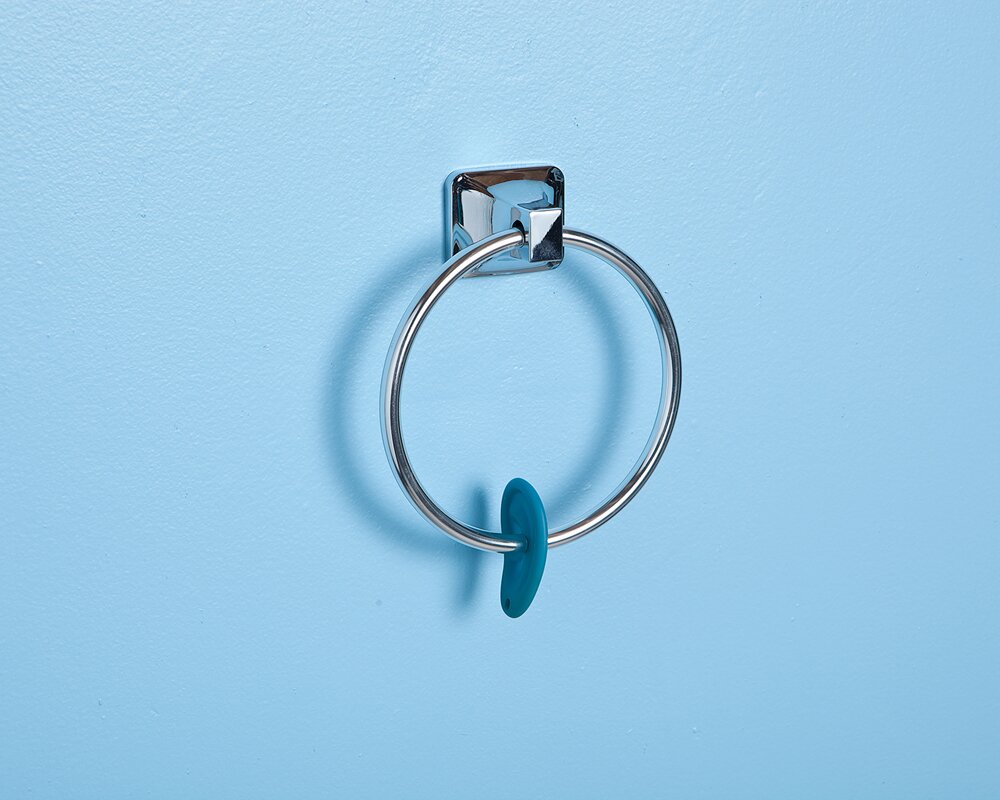
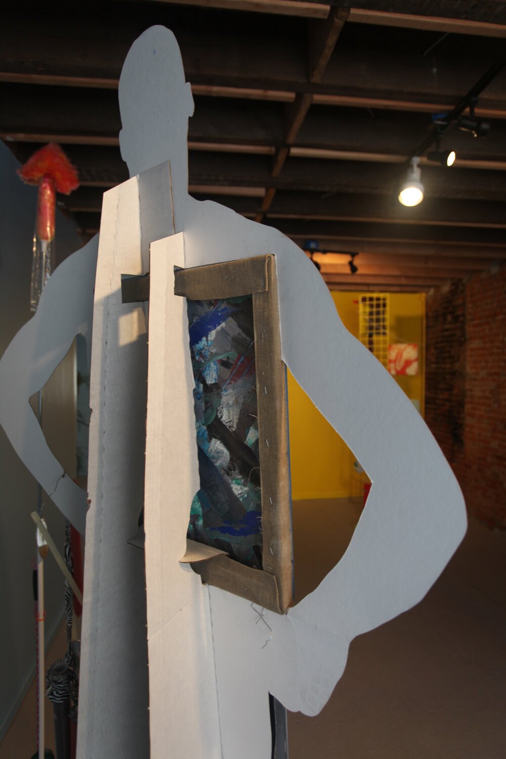
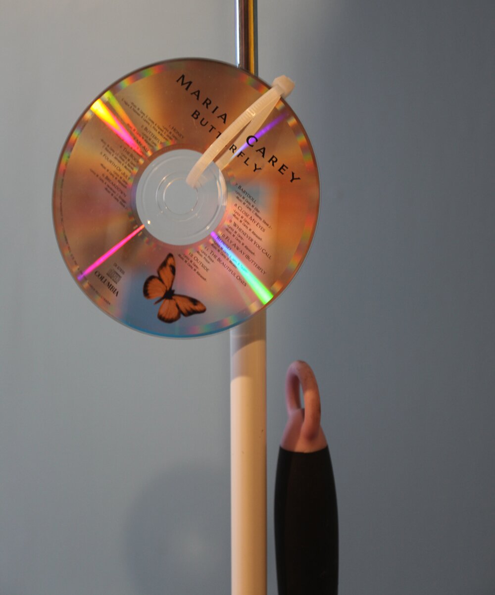
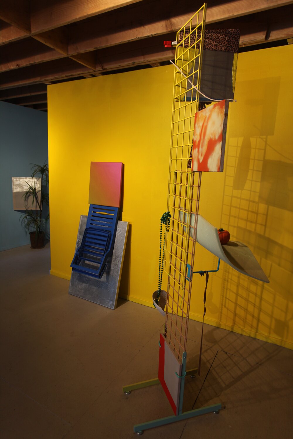
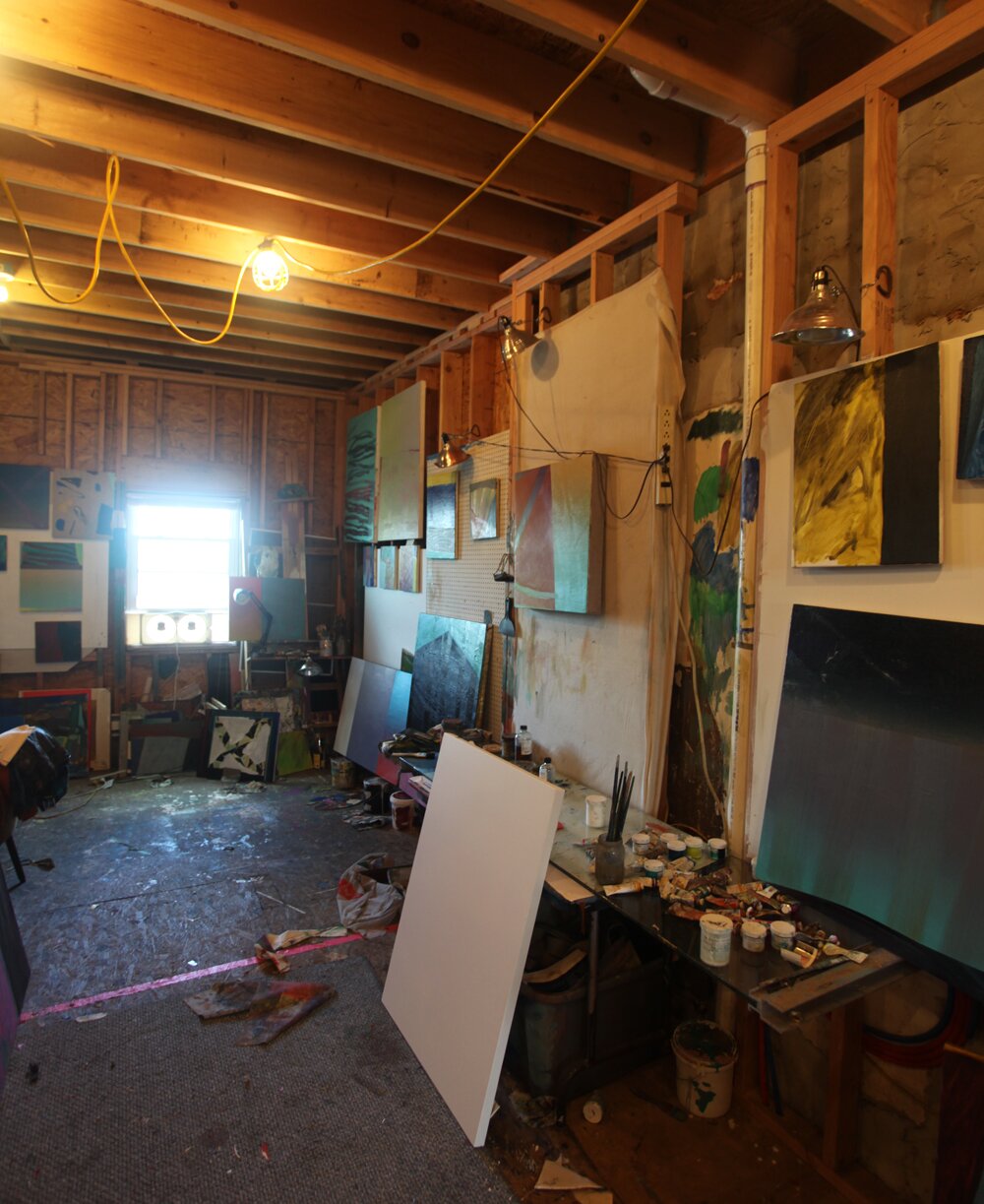
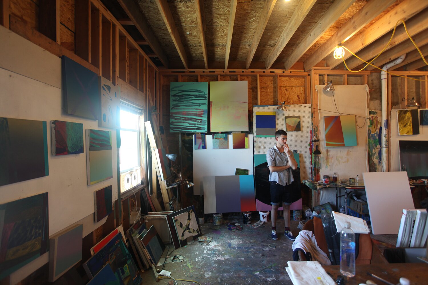
On the 4th of July, we headed to in Philadelphia, PA for an early look at their latest show, ‘Body Without Organs.’ ‘Body Without Organs’ is an installation showcasing the material-based paintings of alongside the playful unconventional sculptural work of . Together, the work is playful but the colors and materials combined create an eerie dream-like environment. We were able to talk with Sean and get his insight on working collaboratively on the show while simultaneously running a gallery space and curating shows. After our interview, we wondered around upstairs to the studio spaces where Sean’s own studio is located.
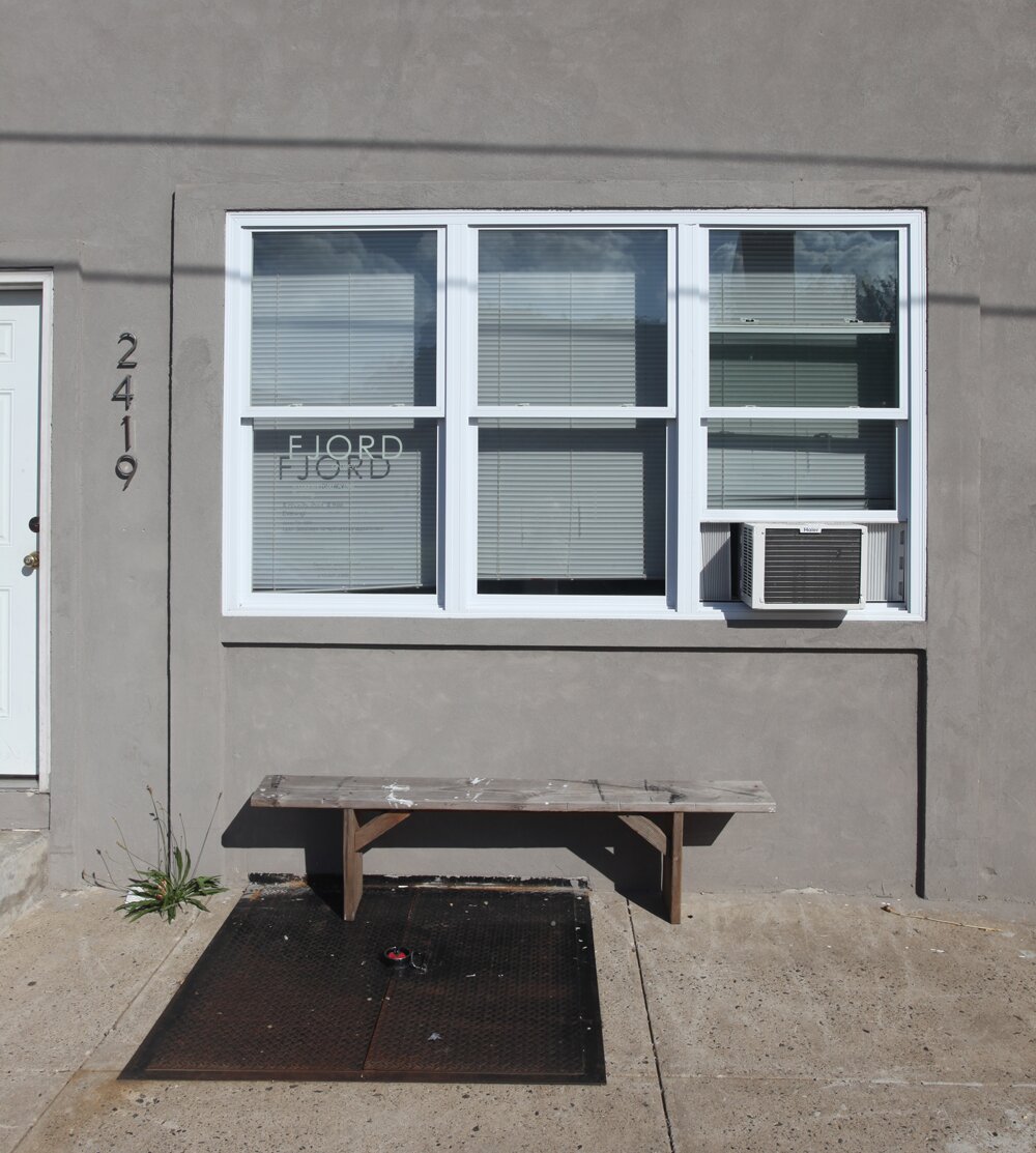
Fjord Gallery is the creation of Philadelphia-based artists, , , and Sean Robert Fitzgerald along with , Cameron Masters, and Justine Jividen. The 3-story building holds a gallery on the ground floor with studio spaces on the 2nd and 3rd floors. ‘Bodies Without Organs’ is FJORD’s 13th show in the gallery’s 1.5 year history and is on view from July 5-28th.
SF: The show is a collaborative work in progress between Alex and I, who met about a year ago and really hit it off in an artistic way. We quickly found that there were a lot of weird parallels between our work that we never even expected because we both work in very different ways and with very different subject matters. We collaborated earlier this year on a project for , which was a lot of fun. We made these short little animated GIF’s that were structured as a sonnet and inspired by imagery culled from some of Jack Smith’s films. We’ve had the idea brewing for this show for a while now, where Alex would basically make these props for my paintings. And by doing so, the paintings themselves are inevitably changed through the very act of collaborating. I came over to his studio and brought 15 or so paintings and told him he could choose whichever ones he wanted. We’ve been throwing these ideas back and forth for a couple of months and here it is!
F: How did you and Alex work together to create the final pieces? Did you re-work the paintings after or did you give Alex complete freedom to do what he wanted with your paintings?
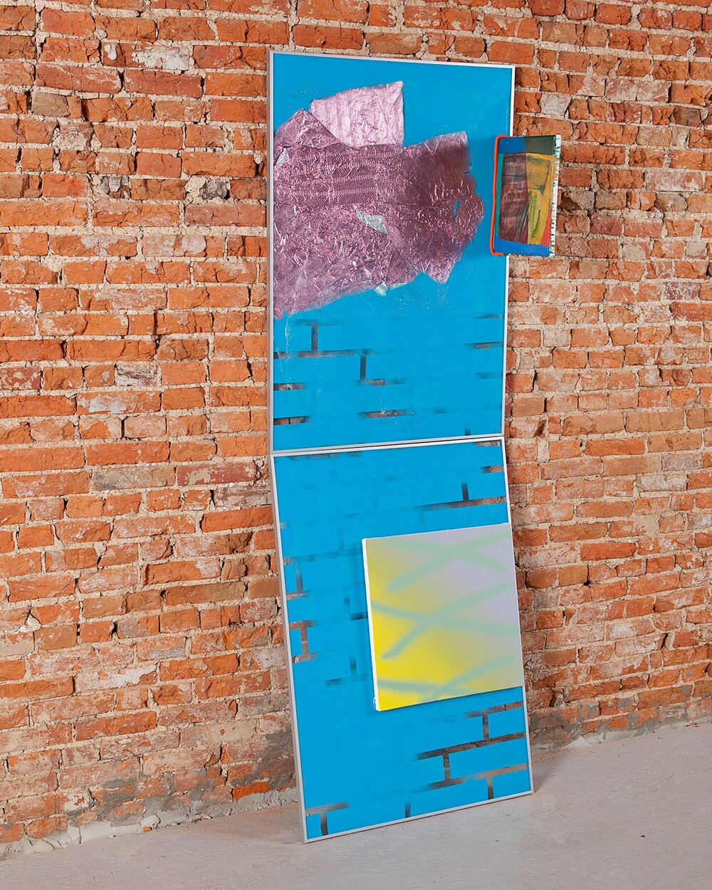
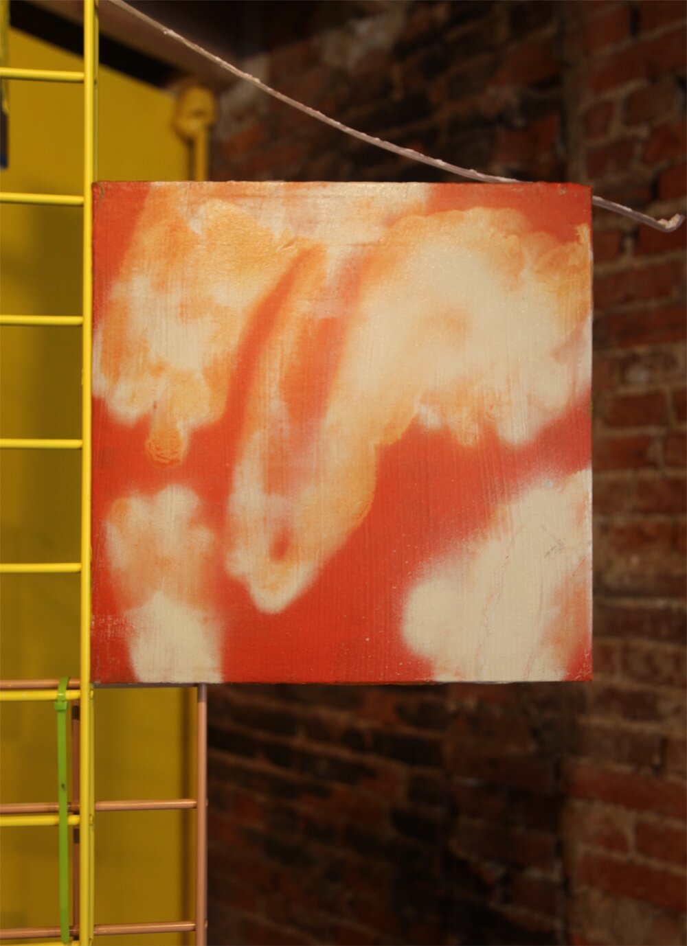
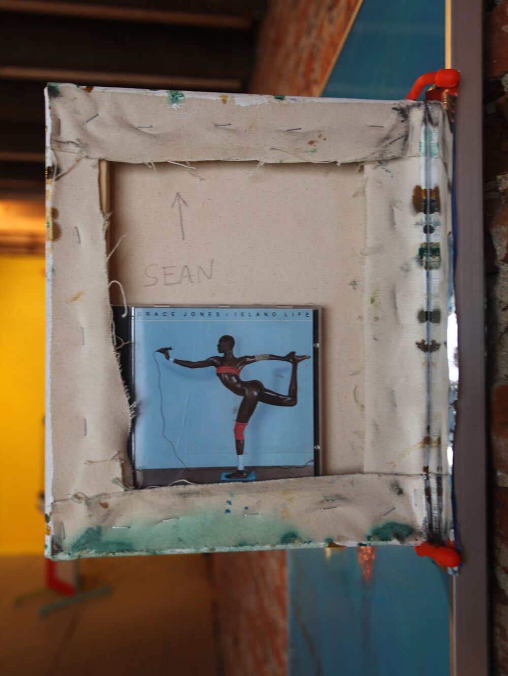
SF: Some of them were more like – “You can do whatever you want,” whereas some of them were much more collaborative. Or sometimes I’d provide him with a loose sort of guideline for how I wanted the piece to be displayed. For example with this piece, the only real requirement I had was that both sides of the paintings had to be visible because a lot of the times, I re-work paintings by flipping the canvas around and re-stretching it. This one, I really liked from both sides. But, for example, the trapdoor piece In the other room we built together and it came about in this really almost unspoken organic way when Alex and I were hanging out in his studio one day. The show is very much about theatricality and parlor tricks so we thought how perfect to stick this little painting in this trap door hovering over this piece of black velvet.
F: It has that cartoon humor, but in this super physical, textural and constructed way. It has this weird mix.
SF: That’s something that I found really interesting when working with sculpture and collaboratively with Alex. As soon as you turn something with this cartoony aspect into something physical it becomes really uncanny and strange. Have you ever seen when they turn things we know as cartoons into real life? It becomes really disturbing. Everything about it feels just wrong and I love it.
F: How do you feel about your canvases and these paintings that are very formal? You can look at them as image driven pieces but the way you are presenting them completely negates that.
SF: I actually really like that. Any opportunity in which an artist gets to see their work in a new context is automatically helpful. Even if you don’t like how you’re seeing it, it helps you think about it in a different way. I like how my paintings become objects in a very different way than if they were stuck on the wall. They have a completely different physicality in the space as part of a sculpture.
F: Was there one particular piece that you see totally different now?
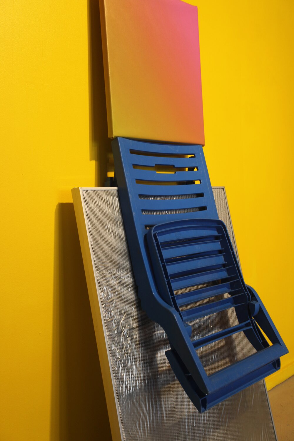
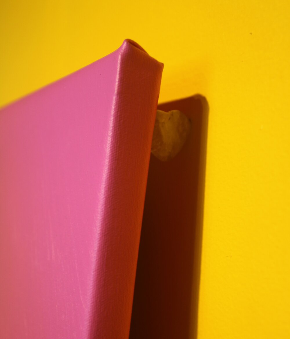
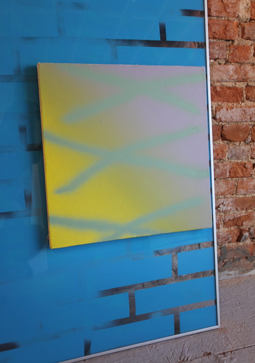
SF: Yeah, this one over here is really cool. So going back to the idea of trickery or theatricality and parlor tricks, this one, I now see completely differently. First of all, the yellow wall completely sucks out this actually bright cadmium yellow and makes [the painting] into this poopy green. So that totally changed and the fact that this painting was re-streched over another support. The whole thing is really disturbing in that magic-trick or cartoon way because it looks like it’s floating when actually, if you look closely, the entire piece is supported against the the wall by this crystal heart at the top. It’s nice to give the viewer these extra little nuggets of detail that they can notice should they want to really engage with the piece in a more than superficial way.
F: The illusion is broken by having the heart there. It’s a smack in the viewers face which is great. How did you determine what the color of the wall should be? Did you create the pieces and then choose a color from
the objects?
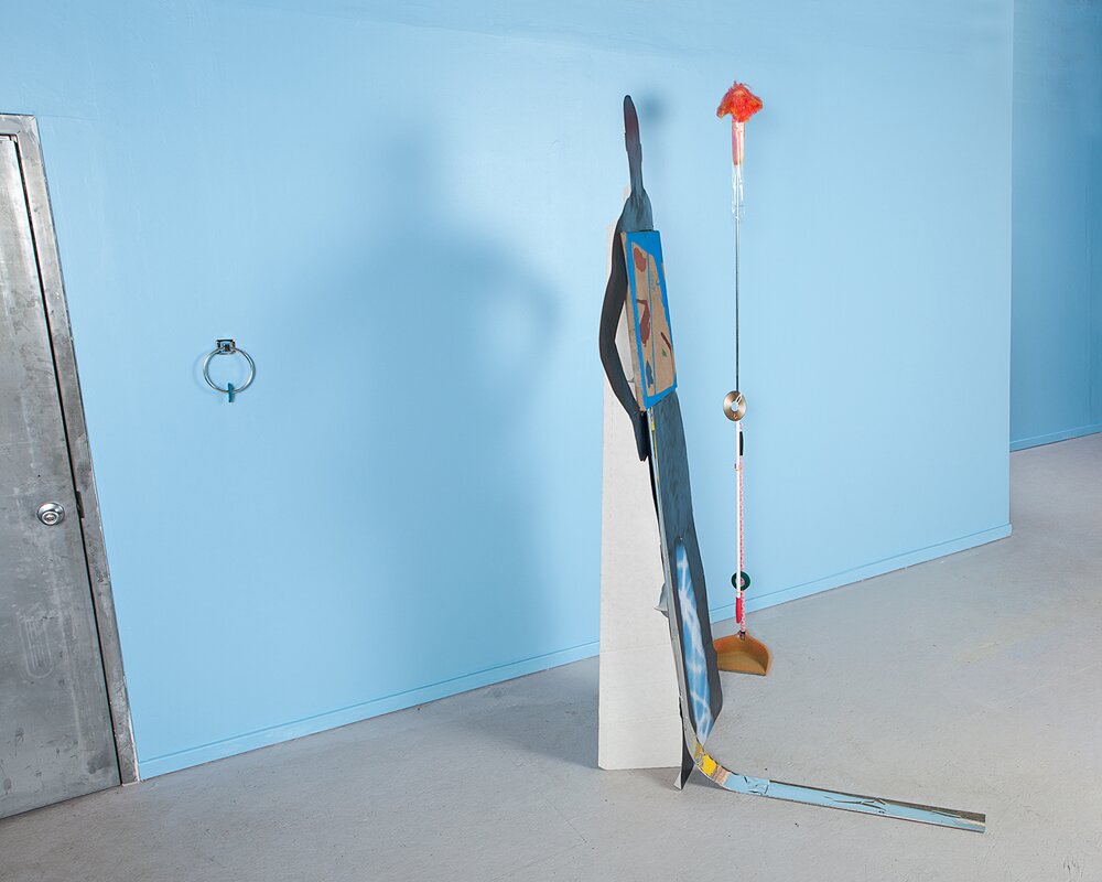
SF: The wall colors came from a couple of different things. In certain aspects, the choices for the wall colors were formal, but they also help to relate the pieces back to each other and form this sort of narrative throughout the show. Also, this Grace Jones album cover was a big inspiration for a lot of it which really just clicked as soon as Alex showed it to me and then everything came full circle and made total sense.
F: Yeah For sure! This is exactly like the promotional image with the figure in black tights.
SF: Absolutely, which goes back to the Grace Jones cover, which goes back to this figure sculpture, which goes back to the title, which goes back to the ‘body without organs’ idea and the act of collaboration. It’s all a big circle.
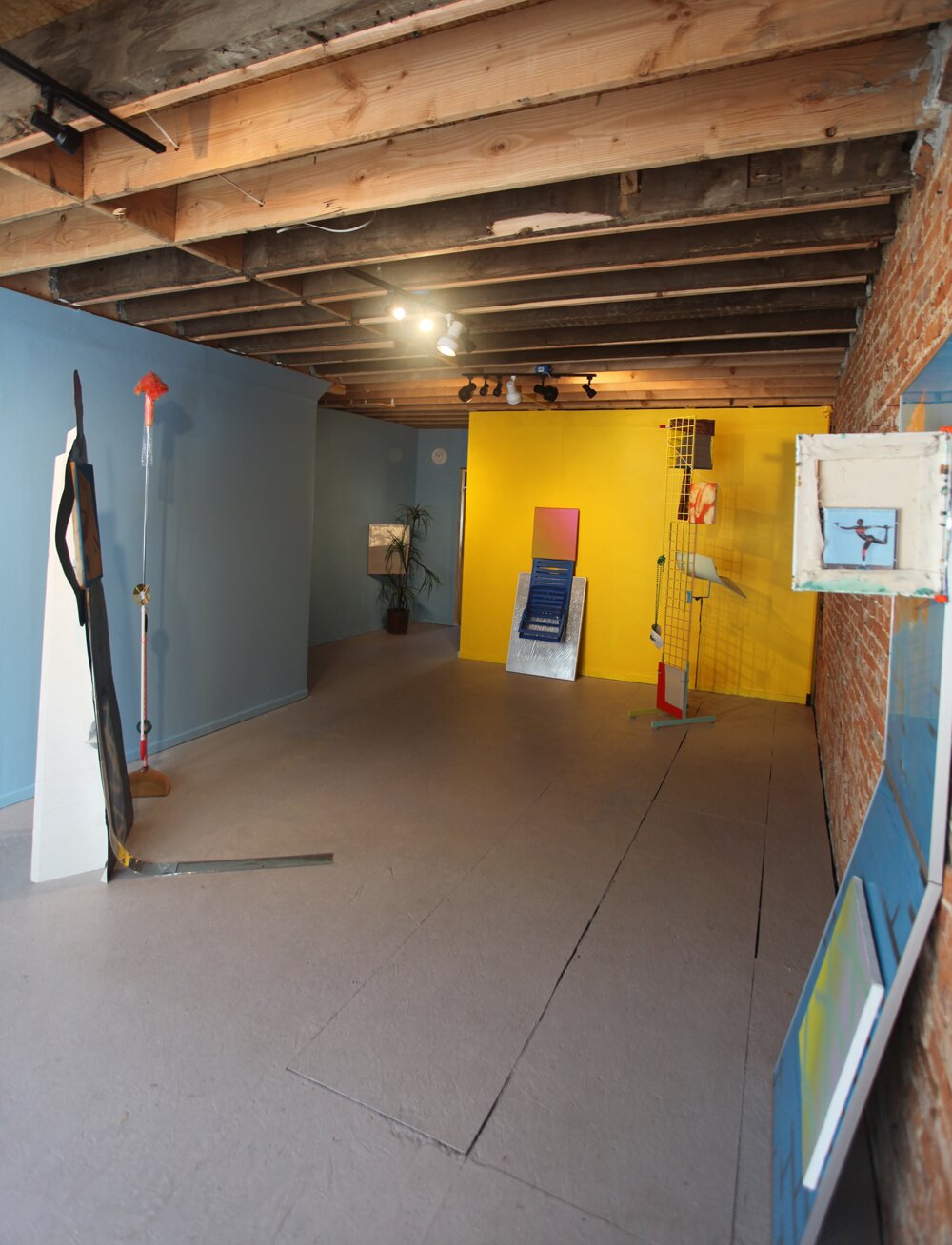
F: There’s also this domesticity about the objects as well. I feel that this is a strange out of place apartment that I’ve walked into. The space feels like an apartment. Was it ever one?
SF: Yeah I think it was before it became Fjord. There’s actually 9 studios upstairs but it probably was an apartment and probably will be again which is really weird to think about. There’s definitely this really uncomfortable stage set thing going on. We made the installation and set the lighting knowing it was going to be primarily viewed at nighttime, so the lighting is very specific. For example, The other room is terribly uncomfortable in the way its lit. There’s only 2 lights and they’re really dim so it feels like you’re on the set of a David Lynch film or you’re stuck in a bad made for TV movie. In this space with the plant, you get the impression you’re in an office waiting room and everyone else waiting is smoking these cheap cigarettes and you just want to get out but you can’t.
F: All the details have been stripped away where this is a stand-in for an entire space stripped down to its very basic parts. Also with the idea of a cartoon, the logic of when you make a caricature, you draw certain attributes to create an intimate recognizable thing and this has the same vocabulary.
SF: I agree, especially because everything is a prop for itself. The clock doesn’t work and the palm tree doesn’t grow. It’s a really good way of thinking about it.
F: When you look at the space that way, you seem to notice the construction of the building too.
SF: Its funny, all of those things disappear when the walls are painted white. As soon as you paint them a color you’re transported to that house that hasn’t been built yet and you start to notice that the ceilings aren’t properly finished and maybe all of these things are actually floating off the ground a few inches.
F: All the objects feel like they came out of this apartment too.
SF: Yeah, this apartment that doesn’t actually exist. Or this cartoon apartment turned into this real-life nightmare tragicomedy with a man that you can only see out of the corner of your eye. Dressed in black, moving things around.
F: Also you have the transparent brick pattern over brick.
SF: A fake of a fake. The show is very much about things you’re not actually supposed to see. As if we were watching a magician from behind.
is up until July 28 at FJORD Gallery. You can see more of Sean Robert Fitzgerald’s work at .

