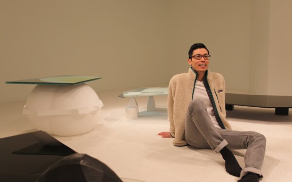
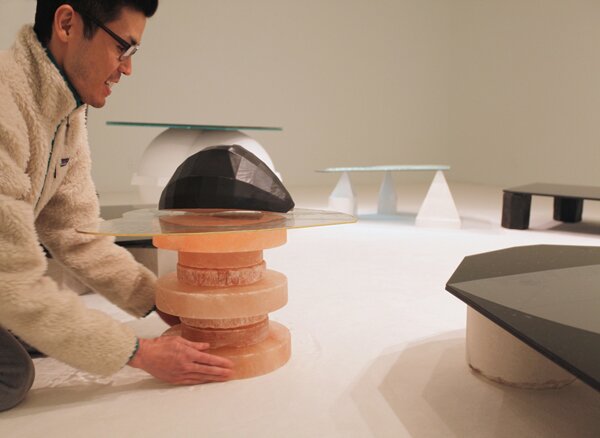
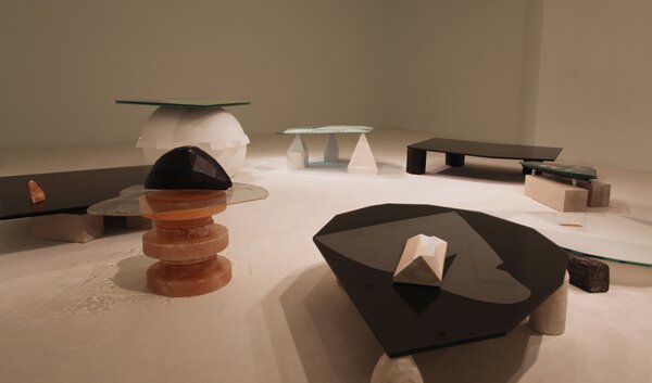
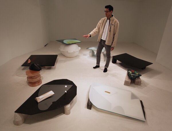
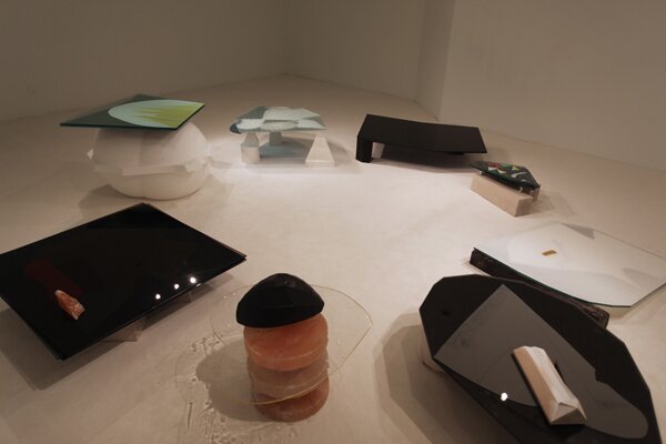
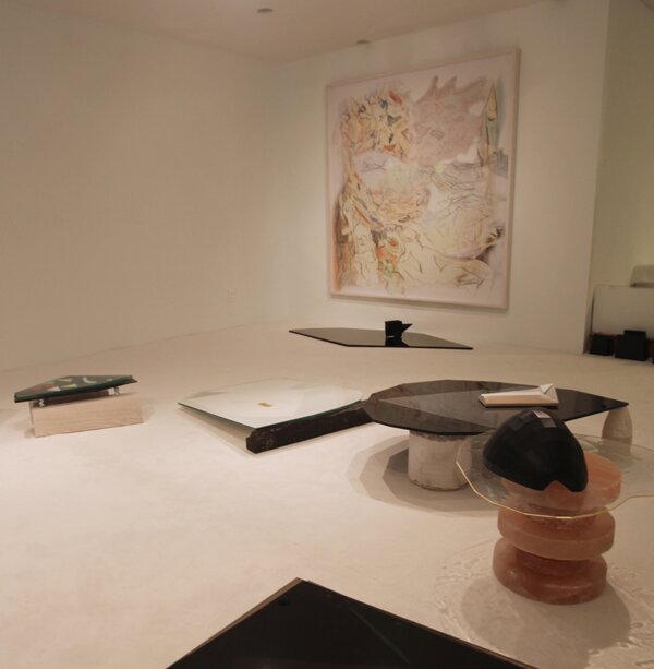
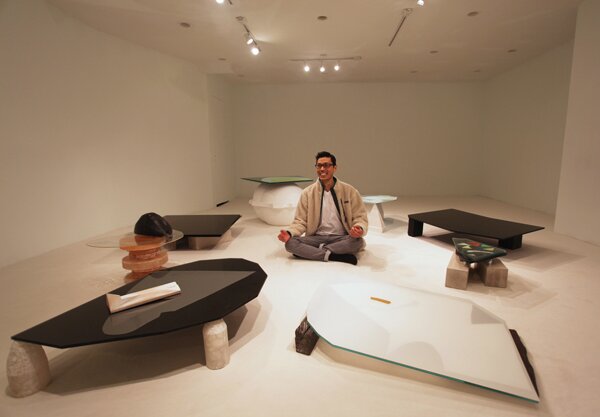
Christopher K. Ho is a New York based artist. We visited him while he was finishing installing his current show “Demoiselles d’Avignon” at . Utilizing 3D printed ceramics, antique glass and Color-aid paper, Chris creates art objects that vacillate between utilitarian coffee table-like sculpture and constructed painting. Following the path of his last show “Privileged White People” at he revisits the relationship between the primitive “other” and abstraction.
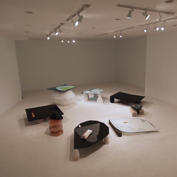
We were transported into a Miami penthouse-esque room complete with white carpeting upon walking into Y gallery on Orchard Street. Subsequently, our shoes would soil the carpet, a process that reminds the viewer of their own presence and turns the carpet into a literal “un-painted” ground.
F: Can you talk about what you want to achieve in terms of the feeling of the gallery space?
CH: With stairs going down slightly at the entrance, low ceilings, and track lighting, Y Gallery evokes a kind of Upper East Side 1950′s gallery—akin to an apartment and quite distinct from contemporary art spaces elsewhere on the Lower East Side or in Chelsea. So I chose light fixtures to go along with the gallery’s domestic feel. The carpet is also domestic—albeit 80′s LA or 90′s Miami rather than ‘50s New York.
F: How did you choose the wall color?
CH: The carpet came first. I balanced the need for a low pile (for stability) and the desire for the whitest carpet available. From the carpet, I chose the wall color. It’s not quite gallery white—it’s tinted green.
F: Could you talk a little bit about your print in relationship to the objects?
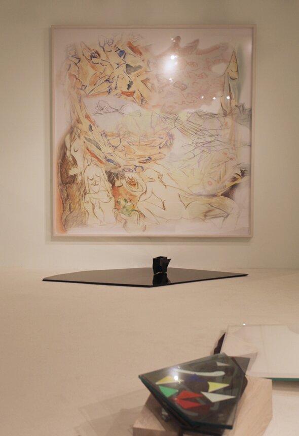
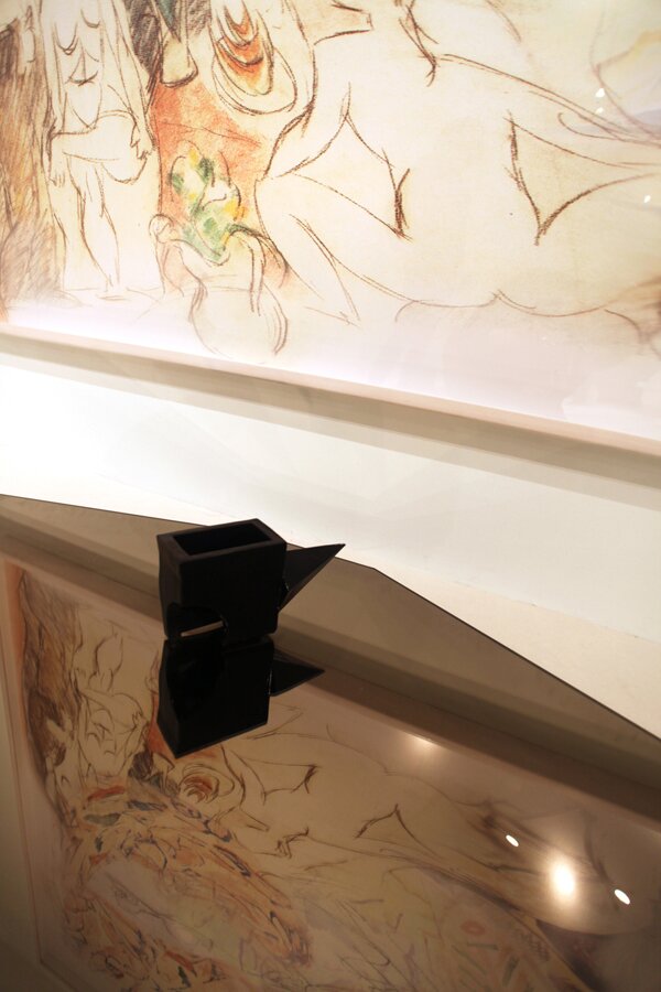
CH: The print is a montage of several of Picasso’s sketches for I tried to give it a dream-like quality. It’s an evident link to the exhibition’s title.
F: It very much has this digital Photoshop feel but it also has the hand peeking through.
CH: The hand is from a drawing of Picasso’s that was blown up and proportioned in the aspect ratio of “Demoiselles d’Avignon,” which is not quite square.
F: Going back to the objects…. I start thinking about Picasso’s sculptures.
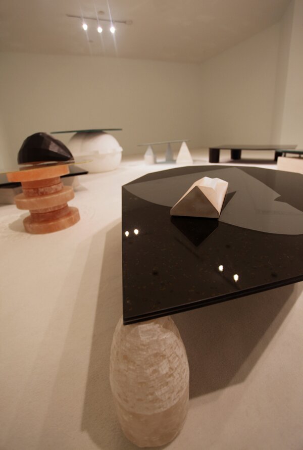
CH: The piece over there titled “Pastiche” with white ceramic pyramid-shaped feet is the most Picasso-esque, I feel, partially because the cast pattern of the Marisco glass resembles the stippling of his late work. But as Alex Benenson points this out in his for this exhibition I wasn’t thinking about it and other works as analogues to, say, “Demoiselles” so much as to the African masks that purportedly inspired Picasso. These [referencing the pieces] would be like the masks at the Trocadero, which some future artist might encounter as the “other.”
F: It’s great to see how these are so layered and you can almost read them as paintings.
CH: And I would encourage that reading….paintings-slash-coffee tables!
F: Do you have a set imagined space in mind when you create them?
CH: They were made as individual pieces. I did not have Y Gallery, or any gallery, in mind. I suppose I knew they were half paintings, half coffee tables and that there was a possibility they would end up in domestic settings.
F: Would you be okay with them being utilitarian objects at some point?
CH: If these don’t sell, I’ll use them—I need coffee tables too!
F: The objects resting on top transform them into pedestals too. Having objects resting on top of certain ones draws attention to the lack of objects in others.
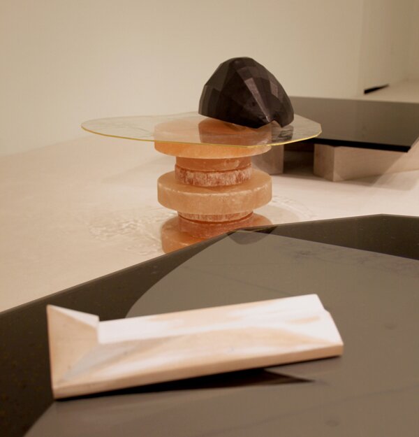
CH: The objects were chosen and placed to give material and textural contrast. I think that the fundamentals of art—material, form, color—are interesting again.
F: It is interesting talking about getting back to fundamentals because Color-aid is literally the first thing you do as a student: “Look what this red does next to this yellow…” Other than the Color-aid, what are some other materials you use in the coffee tables?
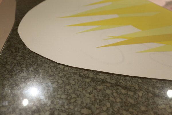
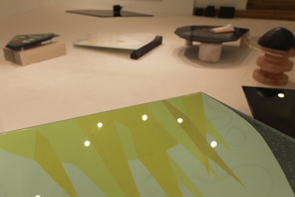
CH: In “The White One,” the bottom sheet of glass is Starphire, an ultra clear glass with an intense green edge. The top is flashed opal, which is a colorless soda-lime glass fused to a thin white layer that creates very little shadow. There’s weird stuff that happens in it too with the Color-aid. The deep brown Color-aid beneath is cut into wonky shapes.
F: It looks like you wet the paper in places to make it more transparent.
CH: I began with tiny sketches made on newsprint with a Sharpie—hence the looseness. Then I enlarged the sketches and reproduced them as watermarks on thick sheets of paper. Then I cut the watermarked paper into various shapes and made templates for the glass in response to those shapes. Finally, I added cut Color-aid.
F: Are the paper sheets adhered to the glass or are they sandwiched in between?
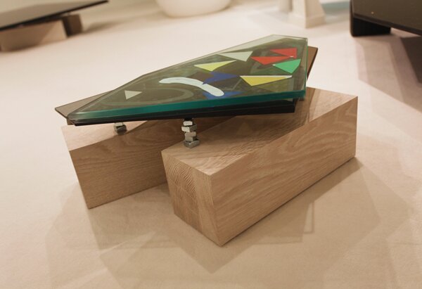
CH: They’re sandwiched in between and held in place with slivers of archival double-sided tape. The handmade paper is thick and rough, so it doesn’t stick particularly well. Also, everything has a slight angle to it. Nothing is at a perfect horizontal.
F: It gives it this trapese act if you will.
CH: They look unstable, right? But they’re all sturdy.
F: What kind of material is that?
CH: It’s antique glass edged with five types of gold leaf, in a gradient from rose to yellow. Because, really, one type of gold leaf is not enough for vivacity.
F: I saw at your last show “Privileged White People.” You used gold leaf in the pedestal piece “Trout College.” Gold leaf seems to play a role in your work.
CH: Who doesn’t love gold leaf? “Privileged White People” also included a piece with watermarked paper squeezed between sheets of glass. It was propped on four bottles of Issey Miyake’s L’eau d’Issey. This show evolved from that piece. I haven’t reconciled privileged white people and primitivism, but there’s something there…
Demoiselles d’Avignon is up until May 4 at Y Gallery, 165 Orchard Street. You can see more of Christopher Ho’s work at

