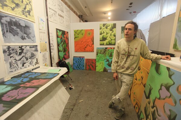
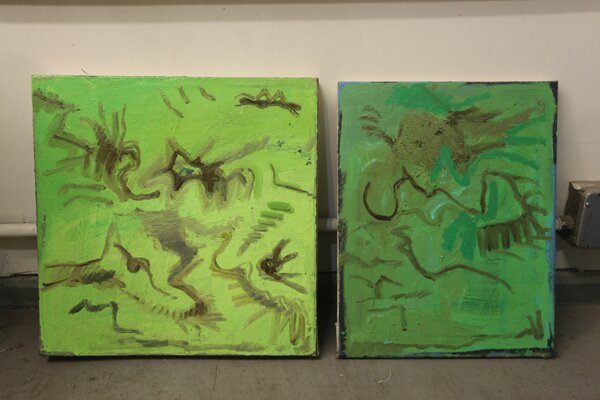
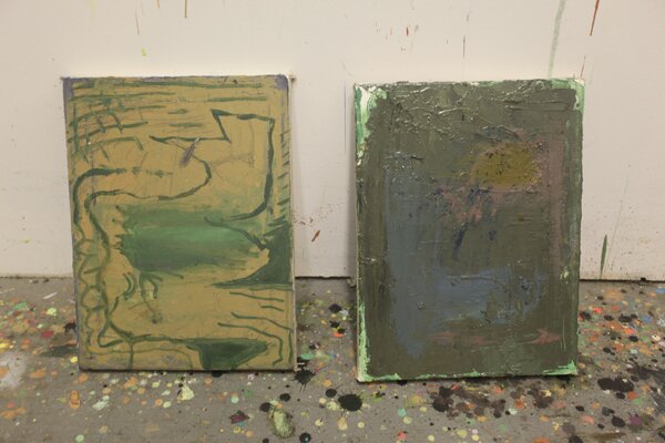
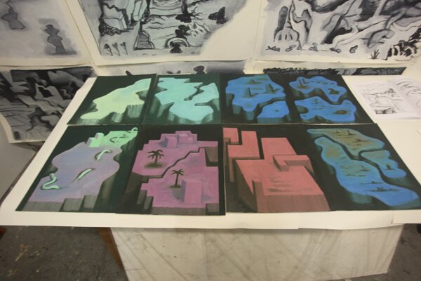
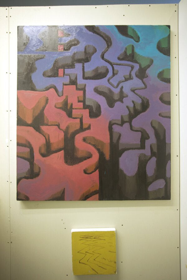
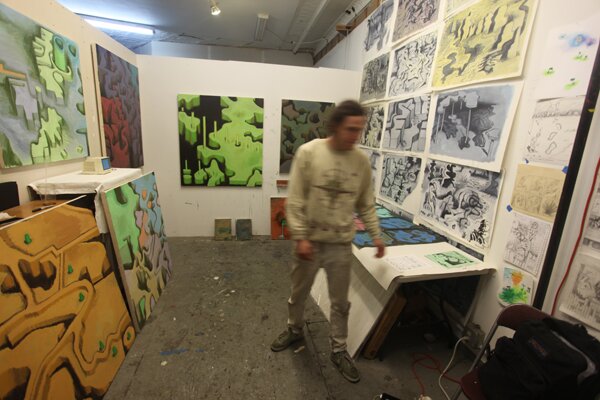
Clayton Schiff is an oil painter living in Bushwick, New York. He graduated from painting department in 2009. His studio is located in the old space in Brooklyn. He most recently had a show of a group of paintings on paper at the . In his interview, Clayton talks about his process in creating the images and his exploits in his studio.
F: To start off, tell me about what you’re working on.
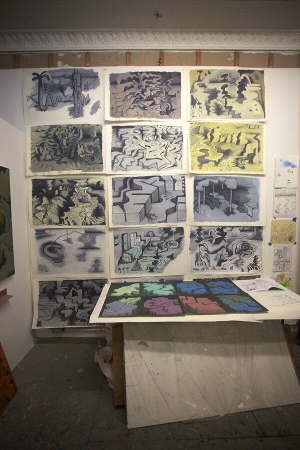
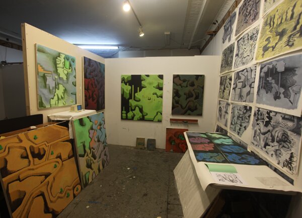
CS: These paper things, they were probably all done within a couple of months of each other about a year ago. At the open studio, I probably got more responses to them than the other ones. Somehow in spite of them being thin and more collapsible, they seem to pose a bigger storage issue than the rest. This is what I did with it and then I ran out of space so I stopped doing it. All the paintings on canvas, just about, have been from 2012.
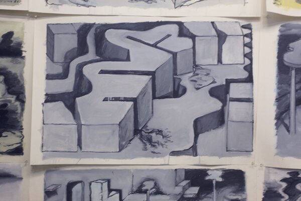
F: For a lot of them, it seems like they have this narrative. I can almost see this videogame type landscape. They have this kind of world view aesthetic. This ‘maze’ that you’ve created has this specific vocabulary. Can you explain how you arrived at this landscape.
CS: Back in school, I started to view a physical correlation between the canvas itself and what was being depicted on it. I was depicting things that were inherently vertical like shelves or something of that sort. The more and more I viewed this illusionistic space, it, to me, seemed like pockets within them-like what would slide into shelves. I sort of wanted to figure out how to make something that would tell the viewer of receding space but at the same time, declare some kind of illusion to the canvas and still function as a canvas.
F: As kind of an object in a way?
CS: Yeah and that becomes less and less of a concern but probably becomes built into it. One of the challenges I have is to not make it function as a landscape but maybe a keep it a little top heavy or do something that keeps it flat so that the bottom is closer and the top is farther and to keep the entirety of the plateau functioning like the surface.
F: Yeah, so you want it to be this illusionistic space but at the same time, keep it as this flat realm.
CS: Yeah and I want it to be not too seductively illusionistic or not too … I didn’t want the space to fully trick the viewer into a projection of his or her inhabitance but sort of consciously, I have presented itself and to offer up amenities as part of the space.
F: Right and then you can break it down further into each object or negative space.
CS: One thing I thought about at the time which I haven’t thought about lately, is the idea of the vertical forms, the wall forms which would typically be the ones that don’t recede.
F: Right, the ones that stay flat and parallel…
CS: Yeah, they remain parallel to the canvas. Those being the ones where there is illusionism and the surface ones where they flatten.
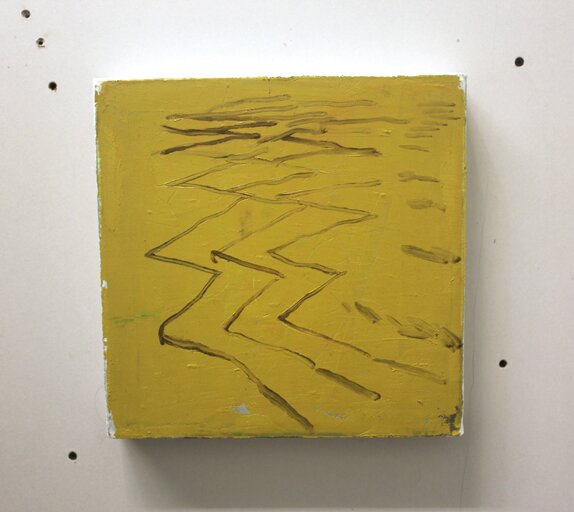
F: I think the two most successful ones, in that sense, are the ‘blue one’ and this ‘red and green one’ because its almost, especially in the ‘blue one’ I see that ‘its a brush mark as a brush mark’ but then that shading with the darker green tone makes it illusionistic. It’s a brush mark but you couldn’t see it going into space without it.
CS: Yeah and with these I think you can separate those ingredients and that might be something I might want to do a little bit more of. The more I’ve tried to diversify them, the less that’s become the central focus.
F: Then it becomes a narrative of your scene whether that becomes the profile of a face or an anamorphic figure. In the same way, you have these brush marks that retain themselves as being brush marks but through the nature of the shape or the negative shape, it creates a kind of landscape or an intestinal tract or whatever you see in it. It’s also interesting how you use color. It seems like you use very specific color palettes in each of your paintings. Can you talk about that?
CS: That’s something I haven’t had too much of a good hold on. I think that this year, I’ve maybe gotten a little bit better at it probably because I’ve accumulated more paints. A lot of the time, its been a matter of a sort of accident and feeling indebted to this sort of faith that I have. In this one, I made the disgusting batch of mud and it came to look intentional because I added slight variations to it. But I’m basically trying to figure it out. As far as what I strive for with color, it’d be something that is fundamentally not naturalistic but that applies to things that one can relate to or that lends itself to a context that you won’t be overwhelmed by, something that makes for easy association but that still has a feeling of urgency.
F: It almost reminds me of a child’s drawing where you have green as the grass and blue as the sky but then you’re doing it and kind of twisting it. It seems like there’s a lot of a influence especially with the paper ones. I think it creeps into the oil on canvas ones as well. It reminds me of his very figurative work and his work. Do you have an affinity towards ?
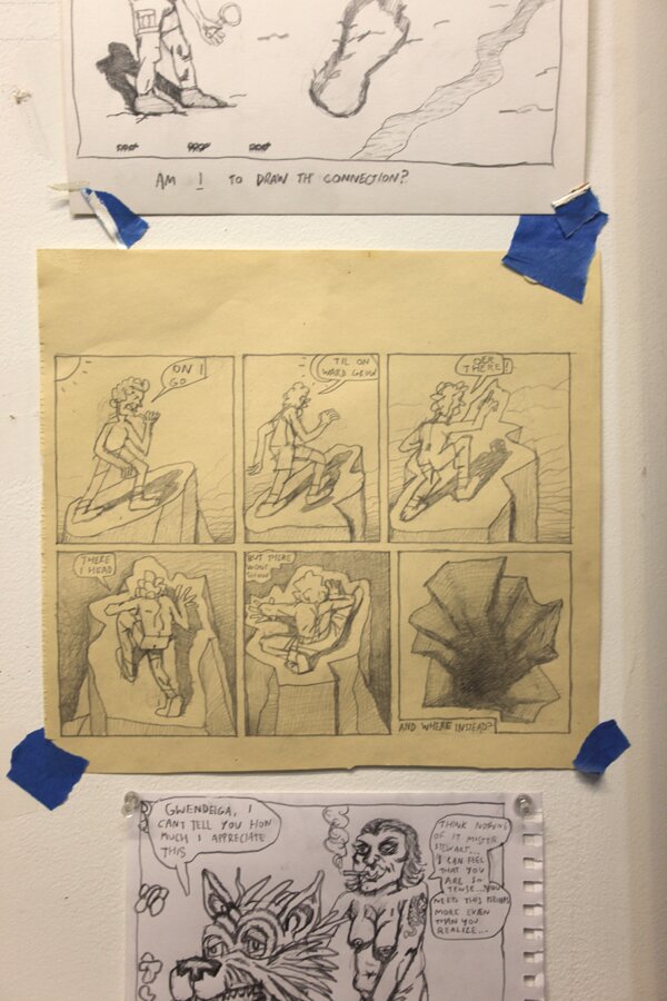
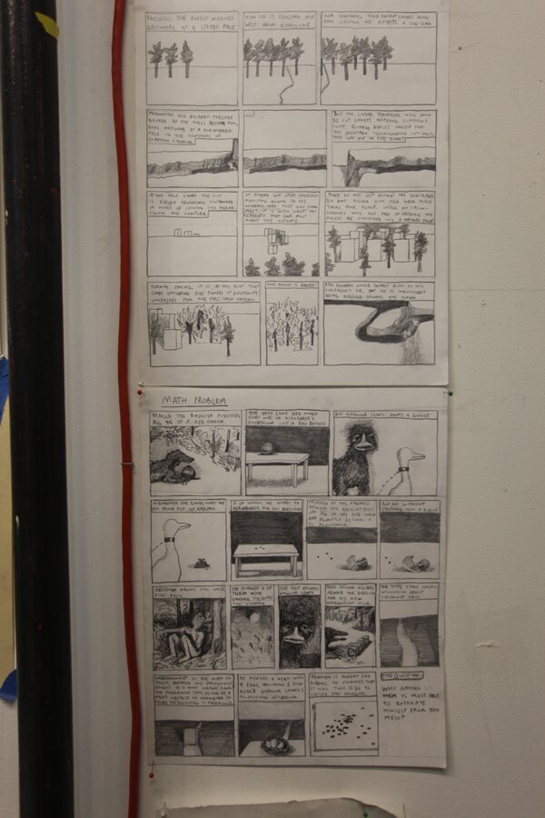
CS: I think perhaps an embarrassing sentiment towards him that I haven’t yet figured out a good way of masking or dealing with other affinities, but I do. I think a lot of it also might relate to cartoons in this codified way of dealing with form and this very minimal way to conjure something. I think the things like the hand and the certain kinds of wobbliness comes naturally but the indecision in all that is something that I like.
F: Right and there’s a hesitation there and that’s literally recorded onto the image.
CS: A lot of these to some extent, I’ve been thinking about them as trying to build an island to stand while wading in the water or something. It might be a little heavy handed but if my initial lines in my initial ways of establishing the form wind up being super tentative because they don’t yet exist and then after a certain point once there’s some kind of coverage, it becomes a matter of tweaking or reshuffling. For a long while, it’s a very tentative kind of venturing out.
You can see more of Clayton Schiff’s work at .

